In the previous post we started to know Template10, the new open source template developed by a Microsoft, with the goal to become the starting point for every Universal Windows app developer. In this post we’re going to see some cool custom controls provided by the library.
The PageHeader control
One of the new features available in Windows 10, when it comes to design the user interface, is the improved flexibility regarding the application bars. In Windows and Windows Phone 8.1 you were able to place an application bar only at the bottom of the screen. Only in Windows 8.1 you were allowed to have a top application bar, but not for commanding purposes: it had to be used to make easier for the user to navigate through the sections of the application.
The bottom application bar was implemented using a control called CommandBar, which makes easier for the developer to quickly add buttons so that that the user can interact with the content on the screen. Windows 10 allows, instead, to place the CommandBar control also at the top. The PageHeader control is an extension of the CommandBar one, so that you can use it not just to provide commands to the user, but also to act as a real header of the page. Thanks to this control, it will be easier to implement the same look & feel offered by many native applications like News or Money, which offer an header with the tile of the page and a set of buttons to handle navigation or content interaction.
The first step to add a PageHeader control is to declare in the XAML page the required namespace, which is Template10.Controls, like in the following sample:
<Page
    x:Class="Controls.Views.MainPage"
    xmlns:controls="using:Template10.Controls"
    mc:Ignorable="d">


</Page>
Now you can add the control to your page by using the following code:
<controls:PageHeader Frame="{x:Bind Frame}" />
One of the key properties is called Frame. As we’re going to se later, one of the key features provided by the control is the built-in management of the navigation framework. To make this feature working, we need to connect to the PageHeader control the application’s frame, which handles the pages and the navigation between them: we can do it using the new x:Bind markup extensions, which is able to perform a binding with objects exposed by the code behind class.
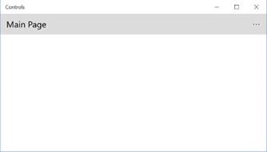
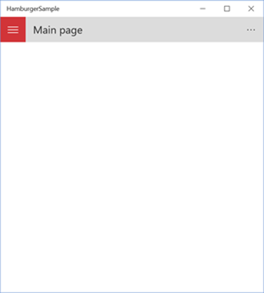
This is how the standard PageHeader control looks like:
Customizing the control
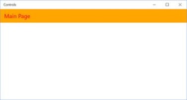
The key property to customize the PageHeader control is Text, which allows to set the text that is displayed in the header (typically, the title of the page). Eventually, you can also customize the standard color that is assigned to the text and to the background, by using the HeaderForeground and HeaderBackground properties. The following samples shows a customized header, with a red text and an orange background.
<controls:PageHeader Text="Main Page" Frame="{x:Bind Frame}" HeaderBackground="Orange" HeaderForeground="Red" />
Handle navigation
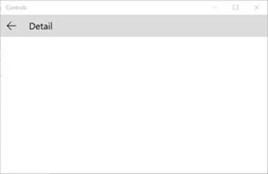
The PageHeader control offers a built-in back button to handle the navigation towards the previous page of the application, which is controlled by a property called BackButtonVisibility. When this property is set to Visible, the button is displayed at the left of the header’s text.
<controls:PageHeader Text="Detail" Frame="{x:Bind Frame}" BackButtonVisibility="Visible" />
However, it’s very important to highlight that the button’s visibility isn’t controlled just by this property, but also by the operating system, which can override our configuration. Specifically:
- The control, thanks to the Frame property, is connected to the navigation’s frame. Consequently, it’s able to automatically detect if there are pages in the back stack so that if it’s empty (for example, because you’re in the main page), the button will always be hidden.
- Windows 10 can run on multiple devices, which can offer a different navigation experience. If, on the desktop, we have more freedom (we can use the virtual back button embedded in the chrome or include it in the UI of the application), on mobile instead you need to leverage the hardware back button available on every device. As such, if you set the BackButtonVisibility property of the control to Visible but the app is running on a phone, the button will be hidden anyway.
- On desktop, as we’ve seen in the previous post, we have the chance to leverage a virtual back button, which is added on the app’s chrome, to handle the navigation. If we have enabled this option (which Template10 applies by default but that can be controlled by the ShowShellBackButton property of the BootStrapper class), the PageHeader control’s button will be hidden anyway.
The commands
As mentioned in the beginning of the post, PageHeader extens the CommandBar control, which is used to add an application bar with one or more commands, so that the user can interact with the current content. Consequently, the PageHeader control offers the same features of the CommandBar one and follows the same principles:
- Inside the PrimaryCommands collection you can add one or more buttons, which will always be visible and represented by an icon and a label.
- Inside the SecondaryCommands collection you can add one or more buttons which, instead, will be hidden by default: the user will be able to see them only by tapping on the three dots displayed at the end of the bar. Secondary commands are represented only with a label.
Inside the two collections you don’t have the freedom to add any XAML control, but there’s a specific subset of controls which has been designed to work with a CommandBar. The most used one is AppBarButton, which represents a button that the user can press. It can have an image (defined by the Icon property) and a description (defined by the Label property) and you can subscribe to the Click event to handle the user’s interaction.
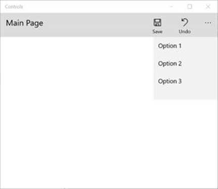
The following sample code defines a PageHeader control with one primary command and two secondary commands:
<controls:PageHeader Text="Main Page" Frame="{x:Bind Frame}">
    <controls:PageHeader.PrimaryCommands>
        <AppBarButton Icon="Forward" Label="Next" Click="OnNextClicked" />
    </controls:PageHeader.PrimaryCommands>
    <controls:PageHeader.SecondaryCommands>
        <AppBarButton Label="Option 1" />
        <AppBarButton Label="Option 2" />
    </controls:PageHeader.SecondaryCommands>
</controls:PageHeader>
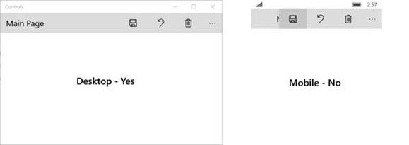
It’s really important to evaluate how many buttons you want to add in the control, especially if you’re application targets multiple families of devices. For example, the usage of many primary commands isn’t a big deal on the desktop: since the screen is bigger and usually in landscape, there’s plenty of available space. The same rules don’t apply to a smartphone: in this scenario, it’s better to reduce the number of primary commands and rely more on the secondary ones.
The following image shows the same layout with three primary commands: you can notice how it works perfectly on the desktop, but it messes up on the mobile (due to the reduced space, the buttons overlaps with the header’s text).
The HamburgerMenu control
Another new Windows 10 feature is the SplitView control, which can be used to implement navigation experiences based on the hamburger menu in your applications. This approach is based on a side panel (typically, it’s placed on the left of the screen) which the user can expand by tapping a button on the top of the panel (usually, in the top left corner). Inside the panel you can usually find multiple items, which can be used to quickly jump from one section to another of the application. The name comes from the fact that the button to show or hide the panel is visually represented by thee lines, one on top of the other, which look like a hamburger between two pieces of bread.
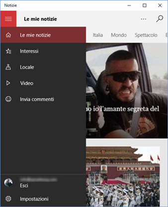
Many native applications are using this approach, like News (which uses the panel to give access to the different sections of the app) or Mail (which, instead, uses the panel to show the available mail accounts with their sub folders).
The SplitView control is just one of the many controls that are available to define the navigation experience of your application: it’s not the only one and Microsoft doesn’t want to force you to use it in any application you create. It’s up to the developer to find the navigation approach that works best for him. Consequently, the SplitView control leaves a lot of freedom to the developer. It just gives you an easy way to split the page in two parts: a sliding panel and the main content. It’s up to you to define the look & feel of both parts.
The downside of this freedom is that we have a bit of work to do if we want, instead, implement a traditional hamburger menu navigation, similar to the one used by some native apps. Template10 simplifies a lot our job since:
- It offers a control called HamburgerMenu, which makes easier to define the panel that will contain the list of application’s sections.
- It offers a way to create a shell, which is a special page that will act as a container for the application. The shell will contain the menu, while the content area will be filled with the various pages of the application.
- It offers a set of built-in styles to recreate a panel with the same look & feel of the one used by native apps (highlight of the current section, icon support, etc.)
Thanks to Template10 we’ll be able to achieve a result very close to the following one:
Let’s see how to implement it.
The HamburgerMenu control
Like the PageHeader control, the HamburgerMenu one is defined inside the Template10.Controls namespace, which you need to add in the XAML declaration. After that, you’ll be able to add it into a page:
<controls:HamburgerMenu x:Name="Menu" />
Customization is allowed thanks to the following properties:
- HamburgerBackground and HamburgerForeground define the background and foreground color of the hamburger button (the one used to show / hide the panel)
- NavButtonBackground and NavButtonForeground define the background and foreground color of the buttons in the panel.
- NavAreaBackground defines the background color of the panel.
An important feature offered by the HamburgerMenu control, compared to the standard SplitView one, is built-in support to two categories of commands, similarly to the PageHeader control:
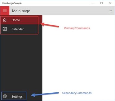
- PrimaryButtons identifies the most used sections of the your application and they are placed at the top of the panel, right below the hamburger button.
- SecondaryButtons identifies the sections of your app that the user will probably visit less frequently, like the Settings or the About page. They are displayed at the bottom of the panel, with a separator at the top.
Inside both collections you can leverage a specific control offered by Template10 called NavigationButtonInfo, which will recreate for you the look & feel of the buttons you can find in the native application. Under the hood, it’s based on the RadioButton control, since it already implements a set of features that are ideal for our scenario (mutual choice between each button, highlight of the currently selected item, etc.)
The following sample shows a complete definition of the HamburgerMenu control:
<controls:HamburgerMenu x:Name="Menu"
                        HamburgerBackground="#FFD13438"
                        HamburgerForeground="White"
                        NavAreaBackground="#FF2B2B2B"
                        NavButtonBackground="#FFD13438"
                        NavButtonForeground="White">

    <controls:HamburgerMenu.PrimaryButtons>
        <controls:NavigationButtonInfo PageType="views:MainPage" ClearHistory="True">
            <StackPanel Orientation="Horizontal">
                <SymbolIcon Symbol="Home" Width="48" Height="48" />
                <TextBlock Text="Home" Margin="12, 0, 0, 0" />
            </StackPanel>
        </controls:NavigationButtonInfo>

        <controls:NavigationButtonInfo PageType="views:DetailPage">
            <StackPanel Orientation="Horizontal">
                <SymbolIcon Symbol="Calendar" Width="48" Height="48" />
                <TextBlock Text="Calendar" Margin="12, 0, 0, 0" />
            </StackPanel>
        </controls:NavigationButtonInfo>
    </controls:HamburgerMenu.PrimaryButtons>

    <controls:HamburgerMenu.SecondaryButtons>
        <controls:NavigationButtonInfo PageType="views:SettingsPage">
            <StackPanel Orientation="Horizontal">
                <SymbolIcon Symbol="Setting"  Width="48" Height="48" />
                <TextBlock Text="Settings" Margin="12, 0, 0, 0" />
            </StackPanel>
        </controls:NavigationButtonInfo>
    </controls:HamburgerMenu.SecondaryButtons>

</controls:HamburgerMenu>
The samples shows a menu with one primary command and one secondary command. Every button is represented with a NavigationButtonInfo control, which has a key property called PageType. You can use it to specify which is the page of your application connected to this button: when the user will tap on it, he will be automatically redirected to that page. Additionally, there are two other properties to customize the navigation experience:
- ClearHistory is a boolean that, when it’s set to true, forces the cleanup of the back stack. It’s typically used with the main section of the application, to avoid circular navigation issues (when the user is on the main page of the app and the back button is still enabled).
- PageParameter is helpful if you need to pass a parameter to the landing page, which can be retrieved using the OnNavigatedTo() method.
The look & feel of the button is up to the developer: inside the NavigationButtonInfo control you can include any XAML control. In the sample you can see a definition that will help you to recreate the same look & feel of native apps: an icon (defined by the SymbolIcon control) and a label (defined with a TextBlock control). Here is how the previous code becomes when the app is running:
The HamburgerMenu control, to work properly, needs a reference to the NavigationService, which is the service provided by Template10 to handle the navigation. This reference is configured in code-behind, thanks to the NavigationService property offered by the control:
public sealed partial class Shell : Page
{
    public Shell(NavigationService navigationService)
    {
        this.InitializeComponent();
        Menu.NavigationService = navigationService;
    }
}
In the next section we’re going to learn how to pass a reference to the NavigationService to the page that contains the HamburgerMenu control, like we’ve seen in the previous sample.
Create the shell
In the previous sections we’ve learned how, thanks to Template10, it’s easy to implement a navigation pattern based on the hamburger menu. However, we have a problem: the HambrgerMenu is just a control and, consequently, you need to add it to a page but, at the same time, you need to handle that every page of your application will reuse the same menu.
Let’s introduce the shell, which is a special page of the application that will act as a container for the pages of the application. By using this approach, the HamburgerMenu control will be defined just once inside the shell and, consequently, we won’t have to include it in every page of the application. The first step is to create an empty page in our project and to repeat the steps we’ve already done in the previous section, which are including a HamburgerMenu control and connecting the NavigationService, like in the following sample:
<Page
    x:Class="HamburgerSample.Views.Shell"
    xmlns="http://schemas.microsoft.com/winfx/2006/xaml/presentation"
    xmlns:x="http://schemas.microsoft.com/winfx/2006/xaml"
    xmlns:views="using:HamburgerSample.Views"
    xmlns:d="http://schemas.microsoft.com/expression/blend/2008"
    xmlns:mc="http://schemas.openxmlformats.org/markup-compatibility/2006"
    xmlns:controls="using:Template10.Controls"
    x:Name="ThisPage"
    mc:Ignorable="d">

    <controls:HamburgerMenu x:Name="Menu">

        <controls:HamburgerMenu.PrimaryButtons>
            <controls:NavigationButtonInfo PageType="views:MainPage" ClearHistory="True">
                <StackPanel Orientation="Horizontal">
                    <SymbolIcon Symbol="Home" Width="48" Height="48" />
                    <TextBlock Text="Home" Margin="12, 0, 0, 0" />
                </StackPanel>
            </controls:NavigationButtonInfo>

            <controls:NavigationButtonInfo PageType="views:DetailPage" >
                <StackPanel Orientation="Horizontal">
                    <SymbolIcon Symbol="Calendar" Width="48" Height="48" />
                    <TextBlock Text="Calendar" Margin="12, 0, 0, 0" />
                </StackPanel>
            </controls:NavigationButtonInfo>
        </controls:HamburgerMenu.PrimaryButtons>

        <controls:HamburgerMenu.SecondaryButtons>
            <controls:NavigationButtonInfo PageType="views:SettingsPage">
                <StackPanel Orientation="Horizontal">
                    <SymbolIcon Symbol="Setting"  Width="48" Height="48" />
                    <TextBlock Text="Settings" Margin="12, 0, 0, 0" />
                </StackPanel>
            </controls:NavigationButtonInfo>
        </controls:HamburgerMenu.SecondaryButtons>

    </controls:HamburgerMenu>
</Page>
public sealed partial class Shell : Page
{
    public Shell(NavigationService navigationService)
    {
        this.InitializeComponent();
        Menu.NavigationService = navigationService;
    }
}
Now we need to:
- Configure the page we’ve just created as container for all the page of our application, by replacing the standard frame.
- Pass to the page a reference to the NavigationService object
Both operations can be achieved in the BootStrapper class: we’re going to use the OnInitializeAsync() method, which is performed right before the app triggers the navigation to the main page.
sealed partial class App : BootStrapper
{
    public App()
    {
        this.InitializeComponent();
    }

    public override Task OnInitializeAsync(IActivatedEventArgs args)
    {
        var nav = NavigationServiceFactory(BackButton.Attach, ExistingContent.Include);
        Window.Current.Content = new Views.Shell(nav);
        return Task.FromResult<object>(null);
    }

    public override Task OnStartAsync(BootStrapper.StartKind startKind, IActivatedEventArgs args)
    {
        NavigationService.Navigate(typeof(Views.MainPage));
        return Task.FromResult<object>(null);
    }
}
The first step is to use the NavigationServiceFactory method to retrieve the proper reference to the NavigationService. This way, we can pass it as a parameter when we create a new instance of the Shell page. Then we assign this instance to the Window.Current.Content property, which holds a reference to the main frame of the application, which will act as a container for the pages. In a standard application, this property is simply set with a new instance of the Frame class.
Thanks to this line of code, the application won’t use anymore an empty frame as a container for your pages, but the Shell page, which contains the HamburgerMenu definition. The final result will be that all the pages of your application will share the same menu we have defined in the Shell page.
HamburgerMenu and PageHeader: the dynamic duo
The PageHeader and HamburgerMenu controls have been designed to work together. The best visual layout, in fact, can be achieved when the various sections in a hamburger menu are handled with a page that has a PageHeader control to define the header.
Moreover, both controls supports the adaptive layout, which is the new approach introduced in Windows 10 to help developers building a single binary package that can runs on every platform (vice versa, on Windows and Windows Phone 8.1 you needed to create and publish two different packages). Adaptive layout is an approach which is already widely used in the web world and it simply means that the user interface has to properly react to the changes in the window’s size, so that the app can always offer the best user experience, regardless if it’s running on a mobile phone or on a console.
Both controls implements this approach to optimize the user experience:
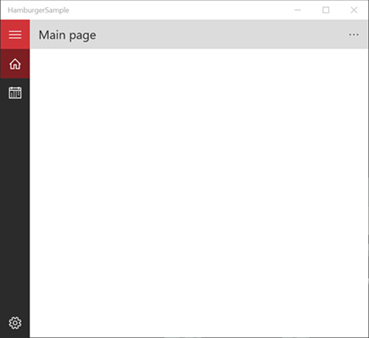
- By default, the PageHeader control doesn’t add any margin to the text of the header. When the app’s windows is wide enough, the HamburgerMenu control will always be visible in minimal mode (which means that the icons will always be visible, while the labels will be displayed only when the panel is open). Consequently, there’s no need to artificially add a margin in the PageHeader control: the hamburger button of the menu already takes care of it.
- When the size of the window is smaller (for example, on a phone) there isn’t enough space to keep the menu icons always visible. Consequently, the panel is completely hidden: only the hamburger button will be visible. In this scenario, the PageHeader control adds a 48px margin on the left, to avoid that the header’s text overlaps with the button.
This behavior is automatically handled by both controls. However, you have the chance to define which is the size of the window that should trigger the two visual states, by using the VisualStateNarrowMinWidth and VisualStateNormalMinWidth properties. Take a look at the following sample:
<controls:PageHeader Text="Main page" Frame="{x:Bind Frame}"
                     VisualStateNarrowMinWidth="0"
                     VisualStateNormalMinWidth="700" />
With this configuration:
- When the width of the window is between 0 and 700, the control applies the VisualStateNarrow visual state, which is the minimal one (the panel is hidden and the header’s text is shifted).
- When the width of the window is bigger than 700, instead, the control applies the VisualStateNormal visual state, which is the standard one (the panel is visible in minimal mode and a shift of the header’s text isn’t required).
The same properties are available also in the HamburgerMenu control: of course, to get the best result, it’s important that the two properties are set in the same way on both controls. The following images will help you to understand better the difference between the two states: the first one is the normal state, the second one is the narrow state.
If you want to disable this behavior for the PageHeader control (for example, because you aren’t providing a hamburger menu based navigation experience and, as such, the shift of the header’s text can break your layout) it’s enough to set the VisualStateNarrowMinWidth property to –1.
Wrapping up
In this post we’ve learned how to use the custom controls offered by Template10. In the next post, instead, we’ll see more C# code, since we will focus on how Template10 can make easier the implementation of the MVVM pattern.
As a reminder, you can find Template10 on GitHub (http://github.com/Windows-XAML/Template10/). The repository contains also a set of samples to start playing with the controls described in this post. Happy coding!



Your three blog pages about “Template 10” is very detail and helpful. I’ve been searching a long time be able to find such a detail explanation the inside mechanism of T10.
Thank you very much for your blog!