Xamarin Forms for Windows Phone devs – Navigation and application lifecycle

One of the core concepts when you create a mobile application is navigation: it’s unlikely that an app is made by just one page, so you need to provide a way to the user to move from one page to the other. We’ve already seen, in the previous post, that the base navigation infrastructure for Xamarin Forms is provided by the NavigationPage class: by encapsulating a basic ContentPage page into a NavigationPage, we’ll be able to navigate from one page to another using the Navigation property, regardless of the platform where the application is running.

Navigate to another page

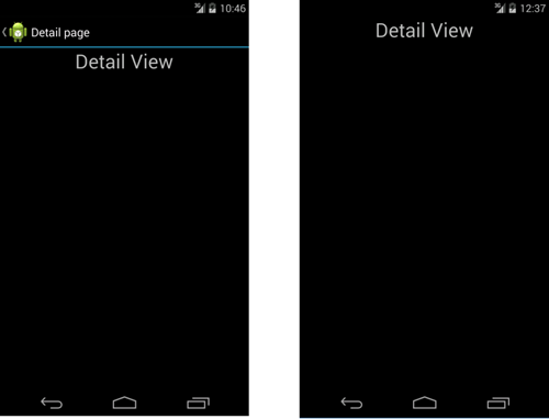
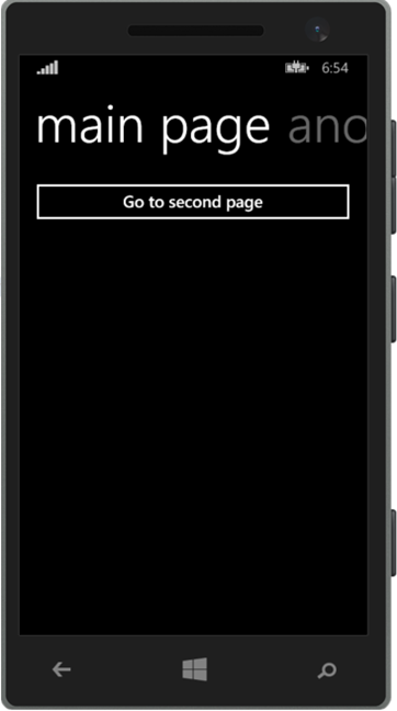
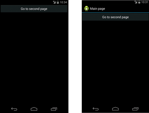
We’ve already seen that, to proper support navigation, we need to encapsulate our page into a NavigationPage. From a Windows Phone developer point of view, this operation is completely transparent to the user: a standard ContentPage and a ContentPage encapsulated into a NavigationPage will look exactly the same, since Windows Phone doesn’t provide a visual way to navigate through the different pages of the applications. The navigation is managed by the Back key, which is a physical button. In Android and iOS, instead, we can notice immediately if we’re using a NavigationPage or not: in the first case, in fact, the application will display an header with the name of the page and an arrow to go back to the previous page, if existing. The following image shows the same ContentPage on Android: the first one is directly displayed, the second one, instead, is embedded into a NavigationPage first. This is an important difference to understand if you’re coming to the Windows Phone world.

navigation


In the previous post we’ve seen the basic way to navigate from one page to the other: by using the PushAsync() method of the Navigation property, which requires as parameter the new page where we want to redirect the user.

private async void OnNavigateClicked(object sender, EventArgs e)
{
    await Navigation.PushAsync(new DetailView());
}

This code is the equivalent of calling the Navigate() method of the Frame class in a Windows Store app or the NavigationService class in a Silverlight app.

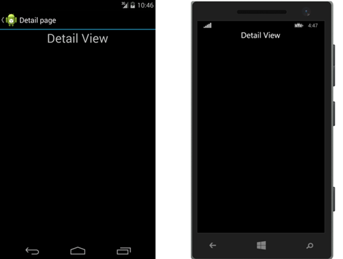
This sample assumes that our project has a page called DetailView: by passing a new instance to the PushAsync() method, we’ll redirect the user to this page. Again, in Windows Phone you’ll just be redirected to a new page and, to go back, you’ll just have to use the Back button; on Android and iOS, instead, the header will change and it will display, other than the page title, a virtual back button to redirect the user to the previous page. The following image will help you to understand the difference:

detail

In case you want to provide in your page an additional button to redirect the user to previous page, you can use the PopAsync() method of the Navigation class, like in the following sample:

private async void OnNavigateBackClicked(object sender, EventArgs e)
{
    await Navigation.PopAsync();
}

The previous code is the equivalent of the GoBack() method exposed by the Frame class in a Windows Store app or the NavigationService class in a Silverlight app.

Displaying a modal view

Android and iOS has the concept of “modal view”, which is a full screen page that is displayed on top of navigation stack. The difference with a standard navigation is that the navigation bar will be hidden and the page will use the whole screen: the only way to go back to the previous page is by using the Back button (in Android) or by adding a dedicated button in the page, that will invoke a specific method offered by the Navigation class. To display a page in modal view, you’ll have to use the PushModalAsync() method, like in the following sample:

private async void OnModalViewClicked(object sender, EventArgs e)
{
    await Navigation.PushModalAsync(new DetailView());
}

The following image shows the difference between a navigation to the DetailView page using the PushAsync() method (on the left) and the PushModalAsync() method (on the right): as you can see, the right page doesn’t have the navigation bar at the top.

modal

On Windows Phone, the PushModalAsync() method and the PushAsync() one has the same effect: since Windows Phone doesn’t have the concept of modal view, the PushModalAsync() method will simply redirect the user to the new page, allowing him to go back to the previous one simply by pressing the Back button. If you want to manually dismiss a modal view and redirect the user to the previous page, you can use the PopModalAsync() method:

private async void OnBackClicked(object sender, EventArgs e)
{
    await Navigation.PopModalAsync();
}

Combining different page’s types

In the previous post we’ve seen that Xamarin Forms offers different types of pages, like TabbedPage or CarouselPage, which were set directly as starting page of our application by assigning them to the MainPage property of the App class. However, we can also combine different page types, to create more complex navigation patterns. For example, we could have a NavigationPage that redirects the user to a TabbedPage, like in the following example:

private async void OnTabbedPageClicked(object sender, EventArgs e)
{
    TabbedPage tabbedPage = new TabbedPage();
    tabbedPage.Children.Add(new DetailView());
    tabbedPage.Children.Add(new AnotherView());
    await Navigation.PushModalAsync(tabbedPage);
}

With this code, the user will be redirected from the current page to another page that will display two different sections: one connected to the DetailView page, the other one to the AnotherView page. Vice versa, we could have a TabbedPage that contains, as children, a NavigationPage, so that we can perform additional navigations from that page:

public class App : Application
{
    public App()
    {
        TabbedPage tabbedPage = new TabbedPage();
        NavigationPage navigationPage = new NavigationPage(new MainView());
        tabbedPage.Children.Add(navigationPage);
        tabbedPage.Children.Add(new AnotherView());

        this.MainPage = tabbedPage;
    }
}

This way, the first section of the tab control (which is a MainView page) will allow the user to navigate to another page of the application (like a detail page). The following image shows a NavigationPage displayed inside a tab:

image

Again, you won’t notice instead any difference in the Windows Phone application: you will just see a Pivot control with two items, one for the MainView and one for the AnotherView pages.

image

The only thing to keep in mind, in this scenario, is that the TabbedPage takes, as label for the tab, the title of the page: in this case, since we’re not directly setting as tab content the ContentPage, but we have wrapped it into a NavigationPage, we have also to set its Title property, otherwise the tab label will be empty. This is the proper code:

public class App : Application
{
    public App()
    {
        TabbedPage tabbedPage = new TabbedPage();
        NavigationPage navigationPage = new NavigationPage(new MainView()) { Title = "Main page"};
        tabbedPage.Children.Add(navigationPage);
        tabbedPage.Children.Add(new AnotherView());

        this.MainPage = tabbedPage;
    }
}

Page navigation

One common requirement in a mobile application is to detect is moving towards the current page or he’s navigating away to go to another page. This approach is very well known to Windows Phone developers: Windows Store apps, in fact, offer the OnNavigatedTo() and OnNavigatedFrom() events, which are often used to load data or to unsubscribe to event handlers. The OnNavigatedTo() event is especially useful to load the data to display in the current page: since it’s an event handler, we can use it also to invoke asynchronous method with the async / await pattern (which, instead, is not possible in the page’s constructor).

These two events are mapped in Xamarin Forms with the OnAppearing() method (that is invoked when the page is being displayed) and the OnDisappearing() method (that is invoked when the user is moving away from the current page):

public partial class MainView
{
    public MainView()
    {
        InitializeComponent();
    }

    protected override void OnAppearing()
    {
        Debug.WriteLine("Page is appearing");
    }

    protected override void OnDisappearing()
    {
        Debug.WriteLine("Page is disappearing");
    }
}

The application lifecycle

If you’re a Windows Phone developer, you should be familiar with the concept of application’s lifecycle. To satisfy the typical requirement of a mobile environment (performance, battery consumption, etc.) all the mobile platform applies constraints to the operations that an application can perform in background. On all the platforms, typically, when an application isn’t in foreground anymore is suspended and it doesn’t have the chance to perform operation: this scenario is managed using other approaches, like background tasks in Windows Phone.

Xamarin Forms has added three methods in the shared App class to properly manage the application’s lifecycle, in case you need to perform additional operations when the app is launched, suspended or resumed. The following sample shows how to declare and use these events:

public class App : Application
{

   protected override void OnStart()
   {
       Debug.WriteLine("Application started");
   }

   protected override void OnSleep()
   {
       Debug.WriteLine("Application suspended");
   }

   protected override void OnResume()
   {
       Debug.WriteLine("Application resumed");
   }
}

If you are a Windows Phone developer, these events should be familiar to you:

  • OnStart() is called when the application is launched from scratch.
  • OnSleep() is called when the application is suspended.
  • OnResume() is called when the application is resumed. It’s important to highlight that this method is invoked only when a previous instance of the app was kept in memory and it’s restored: for example, on Windows Phone, in case of tombstoning (so the process was terminated by the operating system due to low resources) you’ll trigger the OnStart() method at startup and not the OnResume() one.

Wrapping

In this posts we’ve seen the basic concept of navigation and application’s lifecycle management and how they compare to the Windows Phone approach. In the next posts, we’ll start to see how to create a real application using the MVVM pattern. As usual, you can find the samples used in this post on GitHub: https://github.com/qmatteoq/XamarinFormsSamples

Posted in wpdev, Xamarin | Tagged , | 4 Comments

Xamarin Forms for Windows Phone devs – The first project

In the previous post, we’ve seen a brief introduction to Xamarin and Xamarin Forms. In this post we’ll start to play for real with a Xamarin Forms project.

Creating the project

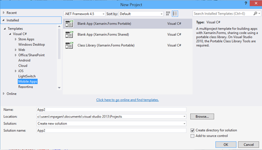
After you’ve installed the Xamarin Tools, you’ll find a set of new templates in Visual Studio. The ones for Xamarin Forms are inside the category Mobile apps:

image

There are two ways to create a Xamarin Form project, which should be familiar to every developer that has already worked with Universal Windows apps:

  • Xamarin Forms Portable: with this template, the shared project between all the different platforms will be a Portable Class Library (PCL).
  • Xamarin Forms Shared: with this template, we’re going to use the same approach used by the Universal Windows apps template. The shared project isn’t a real library, but it’s a collection of files (classes, assets, etc.) that are linked to the platform specific projects. This way, you’re going to host the common files in a single project, but they will be automatically copied and linked to the platform specific project during the build process.

The two approaches are very similar: the main difference is that, with the the shared template, you’ll be able to use conditional compilation in case you want to execute platform specific code in a common class. However, Xamarin Forms, by using the dependency injection approach, offers a smarter and cleaner way to manage platform specific code, so I’ll suggest you to use the Portable Class Library approach. It’s the template we’re going to use in the next samples.

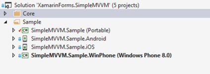
When you create a new Xamarin Forms project, Visual Studio will create a new solution with four different projects: the shared Portable Class Library and three platform specific projects, one for iOS, one for Android and one for Windows Phone. Please note that, unfortunately, at the time of writing, Xamarin Forms still doesn’t support Windows Phone 8.1 and Universal Windows apps: the Windows Phone project created by Xamarin will target the 8.0 platform.

image

In a typical Xamarin Forms project, most of the assets, code and views will be included in the shared project: the platform specific projects will just take care of initialing the Xamarin Forms infrastructure. If you take a look at the main page of each project, in fact, you’ll find that it will just take care of initializing Xamarin Forms and loading the App class of the shared project, which is is the starting point of the application. Let’s take a look, for example, at the definition of the MainPage.xaml.cs file in the Windows Phone project, which should be the most familiar technology for you if you’re reading this blog:

public partial class MainPage : FormsApplicationPage
{
    public MainPage()
    {
        InitializeComponent();

        Forms.Init();
        LoadApplication(new Sample.App());
    }
}

The initialization is performed by the Forms.Init() method, while the application is loaded by the LoadApplication() method.

However, as we’re going to see in the next posts, the various projects can also contain platform specific classes that use APIs or features that are available only on one platform or that are implemented in a different way.

Checking for Xamarin Forms upgrades

Xamarin Forms is simply a collection of libraries that are available on NuGet and that are referenced automatically in every new Xamarin Forms project. Consequently, the first step is to check if there are upgrades to the library, since Xamarin can update it independently from the core Xamarin runtime. At the moment of writing, for example, the latest Xamarin Forms version is 1.3, while the stable Xamarin tools still create projects that are based on the old 1.2 version. Consequently, unless you’re using the beta channel (which already offers the updated templates), you will have to manually upgrade the projects.

The first step is to right click on the solution, choose Manage NuGet Packages for solution and check for updates on the Xamarin Forms project. If you’re still using the Xamarin stable channel and the 1.2 templates , you will need to make some changes to the code, in order to support the new features. Xamarin has published a detailed tutorial on the steps to perform.

Update: Xamarin yesterday released the 3.9 version in the Stable channel, which already provides the correct Visual Studio templates to create Xamarin Forms apps based on version 1.3.

Creating the first view

The main class of a Xamarin Forms app is called App and takes care of initializing the first page of the application, which is provided by the MainPage property. If you open the standard App.cs file created by the Xamarin Forms templates, you’ll find the following code:

public class App : Application
{
    public App()
    {
        this.MainPage = new ContentPage
        {
            Content = new Label
            {
                Text = "Hello, Forms !",
                VerticalOptions = LayoutOptions.CenterAndExpand,
                HorizontalOptions = LayoutOptions.CenterAndExpand,
            },
        };
    }
}

This sample shows you that there are two ways to define a page in Xamarin Forms: by creating the layout in code behind and assigning it to the Content property of the page or by using XAML. Many samples in the web use the first approach, but I prefer the XAML one, since it’s more similar to the traditional Windows Store and Windows Phone development. The first step, consequently, is to create a new XAML page, by right clicking on your project and by choosing Add new item an selecting Forms XAML Page as template. The page will look like a page in a Windows Phone app, with a .xaml file (with the layout) and a xaml.cs file (with the code behind class).

Here is the XAML page:

<?xml version="1.0" encoding="utf-8" ?>
<ContentPage xmlns="http://xamarin.com/schemas/2014/forms"
                       xmlns:x="http://schemas.microsoft.com/winfx/2009/xaml"
                       x:Class="App2.SamplePage">
    <Label Text="{Binding MainText}" VerticalOptions="Center" HorizontalOptions="Center" />
</ContentPage>

As you can see, it looks like a regular Windows Phone page, so the approach should be very familiar for you. You will just have to study a bit the official documentation to learn the differences in the controls and properties naming. For example, the TextBlock control is called Label, while the TextBox control is called Entry; the label of a button is set using the Text property instead of the Content one; binding is supported, but the data context is set using the BindingContext property instead of the DataContext one; etc.

Here is, instead, the code behind file:

public partial class SamplePage
{
    public SamplePage()
    {
        InitializeComponent();
    }
}

Once you’ve created the first page, you’ll have to change the App code to use it, in replacement of the sample page that is created in code. It’s enough to assign to the MainPage property a new instance of the page we’ve just created, like in the following sample:

public class App : Application
{
   public App()
   {
       this.MainPage = new SamplePage();
   }
}

However, the previous code is quite useless: the page we’ve created it’s a ContentPage (as you can see from the name of the root tag in the XAML), which is just a placeholder for the content and doesn’t provide any option that is required when you develop a complex application, like a navigation system to move to other pages or the ability to manage different sections. This is one of the main differences between Windows Phone development and Xamarin Forms: the different concept of pages.

Managing the pages

If you’re a Windows Phone developer, there’s an important difference to understand about the views and the navigation framework. When you create a Windows Phone application, you simply work with pages, that are identified by the Page class in the Windows Runtime or the PhoneApplicationPage class in Silverlight. There are no differences between a page with a Pivot control, a Hub control or a ListView control: they are all pages, what changes are the controls that are placed inside them.

In Xamarin Forms, instead, there are different kind of pages, which all inherit from the base Page class. Most of them are mapped with different Windows Phone layouts:

  • ContentPage is the standard simple page.
  • NavigationPage is a page that offers a navigation framework to move from one page to another.
  • TabbedPage is a page that offers quick access to multiple sections. It’s represented as a page with a Pivot control in Windows Phone.
  • CarouselPage is a page that allows the user to scroll between different pages. It’s represented as a page with a Panorama / Hub control in Windows Phone.

This approach is required because there are many differences between the navigation system of each platform: for example, since Windows Phone has a hardware Back button, the UI doesn’t need to include a software button. However, Android and iOS have a different approach and, in case it’s a page that supports navigation towards another page, they display a navigation bar at the top, that it’s used to move back and forward to the different pages.

Another example is the usage of tabs: in Windows Phone, when an application has different sections or different contents to display, we use a Pivot or a Hub control, which is a way to divide a page into different sub sections, each of them with its content. In Android and iOS, instead, sections are managed with tabs: there’s a main page, with different tabs, and a page for each section, that are displayed inside the tabs.

Consequently, as we’re going to see later, most of the time you’ll work with the ContentPage type, which is the standard page that is used to display information to the user. The other page types, instead, are invisible to the user and they will be used as a container for content pages.

The ContentPage

ContentPage is the basic page that simply displays some content to the user: when you add a new XAML page to your Xamarin Forms project, by default its type is ContentPage, as you can see by the name of the root node in the XAML definition:

<?xml version="1.0" encoding="utf-8" ?>
<ContentPage xmlns="http://xamarin.com/schemas/2014/forms"
                       xmlns:x="http://schemas.microsoft.com/winfx/2009/xaml"
                       x:Class="Views.Views.MainView">
    <Label Text="{Binding MainText}" VerticalOptions="Center" HorizontalOptions="Center" />
</ContentPage>

When you need to define a page that displays some information to the user, you’ll always work with a ContentPage. Consequently, when you create a new XAML Forms Page using the Visual Studio template, you’ll always create by default a ContentPage one, since it’s the only “visible” kind of page, that can display some content to the user. All the other page’s types are “invisible” and simply acts as a container for other ContentPage pages.

The NavigationPage

A ContentPage alone, however, in most of the cases it’s useless, unless your application is composed by just one page. From a ContentPage, in fact, the user doesn’t have a way to move to another page or to another section. This is why Xamarin Forms offers a NavigationPage: it’s simply a container for a ContentPage, which adds a Navigation property that offers some method to move from one page to another.

A NavigationPage is invisible to the user: this is why, when you create a new instance of the class, you need to pass as parameter the ContentPage you want to “encapsulate” into the navigation framework. The following sample shows how to define the App class to use this approach:

public class App : Application
{
    public App()
    {
        NavigationPage navigationPage = new NavigationPage(new MainView());
        this.MainPage = navigationPage;
    }
}

By encapsulating the MainView (which is a ContentPage) into a NavigationPage, we will be able to navigate to another page by using the PushAsync() method of the Navigation property (we’ll talk in details about the navigation system in the next post):

private async void Button_OnClicked(object sender, EventArgs e)
{
    await Navigation.PushAsync(new SecondView());
}

The TabbedPage and CarouselPage

As already mentioned, the TabbedPage and CarouselPage classes are used when you want to display different sections of the application, each of them represented by a different ContentPage. Tabbed pages are rendered with tab controls on Android and iOS, while on Windows Phone with a Pivot control, as you can see in the following image:

The CarouselPage, instead, display the pages one near the other and the user can browse them with a swipe gesture. This approach is more familiar to Windows Phone developers, since it’s the same experience offered by the Panorama and Hub controls:


Like for the NavigationPage, these two page types are just a container for other ContentPage pages, which define the real content that is displayed in each page. The following sample shows how to define a TabbedPage with two sections:

public class App : Application
{
    public App()
    {
        TabbedPage tabbedPage = new TabbedPage {Title = "Tabbed page"};
        tabbedPage.Children.Add(new FirstView());
        tabbedPage.Children.Add(new SecondView());

        this.MainPage = tabbedPage;

    }
}

FirstView and SecondView are two ContentPage pages, which have been added in the shared project. The title of the tab is taken from the title of the page, which is set by the Title property of the ContentPage, which can be set directly in XAML like in the following sample:

<?xml version="1.0" encoding="utf-8" ?>
<ContentPage xmlns="http://xamarin.com/schemas/2014/forms"
             xmlns:x="http://schemas.microsoft.com/winfx/2009/xaml"
             Title="First view"
             x:Class="Views.Views.FirstView">
    <Label Text="First view" VerticalOptions="Center" HorizontalOptions="Center" />
</ContentPage>

Eventually, you can also set an icon to use as section’s identifier, by using the Icon property: some platforms (like iOS), in fact, can display also an image other than just a text in the tab to identify the section.

Wrapping up

In this post we’ve seen how to setup our first project and which are the similarities and the differences between developing a Windows Store app and a Xamarin Forms app. Once you’ve defined the startup page of your application, you can start working with it in the same way you do in a Windows Store app: you can add controls in the XAML page, subscribe to event handlers and manage the user’s interaction in the code behind. In the next post we’ll see in details how to manage the application’s lifecycle and the navigation, then we’ll move on to understand how to implement the MVVM pattern in a Xamarin Foms app. Meanwhile, you can play with the sample project published at https://github.com/qmatteoq/XamarinFormsSamples
Posted in wpdev, Xamarin | Tagged | Leave a comment

Xamarin Forms for Windows Phone devs – A brief introduction

Mobile cross platform development is one of the hottest topics nowadays. The market offers to consumers three major mobile platforms (iOS, Android and Windows Phone), each of them based on its own technologies, patterns and tools. iOS is based on Objective-C or Swift as programming language and uses XCode as development tool; Android is based on Java as programming language and uses Eclipse as development tool (even if there are many other alternatives); in the end, Windows Phone is based on C#, VB.NET or HTML / JS and uses Visual Studio as development tool.

Consequently, if you’re a mobile company and you want to create applications that target all of them, you’ll need three dedicated teams, each of them with their own skills and knowledge. Unfortunately, not all the companies can afford such an investment, especially if mobile development isn’t the core business: for example, you’re a web agency that would like to offers to their customers, other than a website, also a companion application; or maybe you’re an enterprise company and you want to provide mobile tools to your employees, regardless of the mobile device they have.

Consequently, many software companies have tried to find new approaches to allow developers to create applications that are able to share as much as code as possible between all the platforms, so that the development teams don’t need to create three completely different applications from scratch. Currently, there are two approaches to achieve this goal:

  • Web based apps: this approach is based on HTML and Javascript technologies, which are executed on the phone using a WebView control that is embedded into the app. Thanks to tools like Apache Cordova (previously known as PhoneGap), you’re able to access to some of the native features of the platform (like storage, sensors, etc.) by using Javascript APIs. This approach is based on the principle “write once and run everywhere”: you’re going to create a single application, that will run on every platform without any change.
  • Xamarin: this approach allows developers to use Microsoft technologies and tools (C#, Visual Studio, the .NET Framework) to create native application for all the platforms. We’re going to analyze better in this post how it works and which are the differences compared to web based apps.

What is Xamarin?

Xamarin is a company founded by Miguel De Icaza, which gathered together all the teams that created Mono, MonoTouch and Mono for Android, which are the open source implementations of the .NET framework that can run on platforms different than Windows. With Xamarin tools, you’ll be able to create applications for iOS and Android by using C# as a programming language and Visual Studio (or Xamarin Studio) as a development environment. All the iOS and Android APIs have been translated into C# classes and objects which, under the hood, are compiled into native code. Which are the main advantages of using Xamarin instead of a web approach based on tools like Apache Cordova?

  • Performance: the biggest downside of web based apps is that are executed in a WebView, so they don’t offer the same performance of a native app. In addition, the application’s performances change a lot based on the operating system’s version, since typically every new release improves the browser’s performance and compatibility with the latest web technologies.
  • Design: the “write once and run everywhere” approach is great because it minimizes the amount of work for developers, but it reduces the quality of the design and the user experience. Every platform has its own visual style and guidelines, so it’s impossible to create an application with a common visual layout that looks good on each platform.
  • Features: since web apps are based on the “write once and run everywhere” approach, tools like Cordova are able to offer to developers only a minimum set of APIs that are in common between every platform. You won’t be able to use features that, instead, are specific for each platform, like live tiles on Windows Phone or background activities in Android.

What is not Xamarin?

The most important concept to understand is that Xamarin isn’t a “write once and run everywhere” platform. When you develop web apps, you can virtually know nothing about the technical details of the different mobile platforms: creating a web app is just like creating a website, with the only exception that you’ll be able to interact with the hardware thanks to libraries like Cordova. Xamarin, instead, requires a good knowledge of each platform and how the main features are implemented, like the navigation framework, the application’s lifecycle, the design language, etc. A good example is how the design of the application’s pages is defined: you’ll have to design three different interfaces using the specific platform tools, like XAML for Windows Phone or the XCode designer for iOS.

Consequently, Xamarin isn’t a technology to create mobile apps for each platform without having to learn the basics like with web apps, but it will help you to:

  • Reuse your business logic: by using technologies like Portable Class Libraries (PCL), you’ll be able to write the logic just once (like services to interact with a database or a REST service) and to reuse it in every platform.
  • Reuse your existing skills: you’ll still have to learn the basic concepts of developing apps for iOS and Android, but you won’t have to learn a new programming language in the process. You’ll be able to reuse your existing .NET and C# knowledge.

Another important consideration to do is that Xamarin isn’t the best cross platform solution for everyone: if you’re already a Microsoft developer, it’s for sure the best technology out there to reuse your skills to create applications for all the main mobile platforms. However, if you’re an iOS or Android developer is definitely a good investment, but it will require you more time to assimilate it, since you’ll have to learn a new programming language in the process: C#.

In the end, Xamarin isn’t very cheap, so it’s more suitable for professionals and big development teams. Currently, there are three available plans:

  • Starter, which is free but it has many limitations. It doesn’t offer integration with Visual Studio, it doesn’t support Xamarin Forms, it has a limitation in the size of the app that you can create, etc.
  • Indie, which costs 25 $ per month and it’s dedicated to indie developers. The biggest downside of this plan is that it doesn’t support Visual Studio integration.
  • Business, which is the most popular plan. It costs 83 $ per month and it includes all the available features, from Xamarin Forms to Visual Studio integration.

Xamarin offers also an Enterprise plan that includes the same tools of the Business plan, in addition to advanced services like One Business Day support, a dedicated Technical Account Manager, etc.

However, during the recent Connect() event by Microsoft, Xamarin has announced that in 2015 is going to release a new Starter edition, with less limitations and integrated with Visual Studio 2013 Community, the free Professional version recently released by Microsoft for independent developers and small companies.

What is Xamarin Forms?

We’ve learned that using Xamarin requires a good knowledge of each platform, especially when it comes to design the user interface and to manage the navigation. This way, we are able to create applications that follows the specific platform’s guidelines. However, this approach is very expensive for a single developer, since it requires to learn and master every design technology: Windows Phone is based on XAML, Android on its own XML dialect while iOS uses a visual tool called Interface Builder.

Xamarin Forms is a recent technology created by Xamarin in order to partially solve this problem: it offers a new way to create the application’s interface by using the XAML language, which should be already familiar to Windows Phone and Windows developers. Xamarin Forms offers a set of controls (which are represented by a XML tag) that, at runtime, are converted into the most appropriate native control: this way, we’ll be able to define the user interface just once, but the application will continue to have the native look on each platform. For example, if you need to grab the input from the user, Xamarin Forms offers a control called Entry, which is rendered as a TextBox in Windows Phone, as an EditText in Android and as an UITextField in iOS.

With Xamarin Forms, the development approach is very similar to the Windows and Windows Phone one: every page is composed by a XAML file (which contains the layout definition) and a code behind file (which contains the code that interacts with the user interface). You have also access to all the most important XAML features, like binding, converters, styles, behaviors, etc. If you already have a good experience in developing Windows Store and Windows Phone apps like me, Xamarin Forms is for sure the easiest way to reuse your knowledge to create mobile applications for all the platforms.

In the next posts we’ll see, in details, how to create an application using Xamarin Forms, with a strong focus on the MVVM pattern: since this pattern makes easier to separate the user interface from the logic, it will greatly help us to reuse the same code on all the platforms.

What do you need to start with Xamarin Forms?

The basic requirements to start with Xamarin Forms are the Xamarin tools, which can be downloaded from http://www.xamarin.com. Then, you have two ways to use it: with Xamarin Studio, which is the development environment created by Xamarin, or Visual Studio 2013. However, the second one is the only solution that can be used to create applications for all the platforms: Xamarin Studio, in fact, supports only Android and iOS, while with Visual Studio you’ll be able to create a project that targets also Windows Phone. However, Xamarin Studio, unlike Visual Studio 2013, is available also for OS X.

If you want to build applications for iOS you’ll need also a Mac, since Windows doesn’t have the required runtime: however, Xamarin includes a tool called Xamarin Build Host, which can be installed and launched on a Mac that is in the same network of our Windows computer. Visual Studio will be able to connect to it and to use it to build the iOS application and, eventually, to deploy it on the emulator or on a phone that is connected to the Mac.

The Android runtime, instead, can run just fine both on Windows and OS X, so there aren’t special requirements. The only problem you’ll have to deal with is the Android emulator: the native one created by Google is really bad, since it offers really poor performances. Consequently, many companies have created alternative emulators, with the goal to offer better performances and additional tools: Xamarin itself offers an emulator called Android Player, which can be downloaded from https://xamarin.com/android-player. Another good alternative is Genymotion, which is free for personal use. The downside of these emulators is that they are based on VirtualBox, the virtualization technology by Oracle, which doesn’t play well with Hyper-V, which is the Microsoft virtualization technology used for the Windows Phone emulators. Consequently, you have two ways if you want to test your Xamarin Forms app both on Windows Phone and Android:

  • Use a real Android device and keep using the Windows Phone emulator.
  • If you’re reading this post, you probably are a Windows or Windows Phone developer. Consequently, it’s very likely that you already have a Windows Phone device for testing, but not an Android one. Scott Hanselman explains in this post how to change your computer’s bootloader so that you can launch Windows with Hyper-V disabled, without having to completely uninstall it: this way, you’ll be able to launch the Android emulator and keep using a Windows Phone device for testing.

However, there’s another alternative: Visual Studio 2015 Preview, in fact, includes a very fast Android emulator. Since it’s based on Hyper-V, it can run side by side with the Windows Phone emulator. The only downside of this approach is that you’ll need to use preview software: other than installing the Preview version of Visual Studio 2015, in fact, you’ll need also to switch to the Xamarin beta channel, since the current stable version supports only Visual Studio 2013. To do that, you’ll need to open Xamarin Studio or Visual Studio (after you’ve installed the Xamarin Tools) and, in the Settings, check for updates: by default, Xamarin is set to use the Stable channel, but you can switch to get updates from the beta or alpha ones.

Wrapping up

In this post we’ve seen what are Xamarin and Xamarin Forms and why it can be a great solution for Microsoft developers to create applications for all the mobile platforms. This post was just a theoretical introduction to this platform: in the next ones we’ll start to see some code and how to create our first cross platform app reusing the skills we’ve acquired by developing apps for Windows and Windows Phone.

Posted in wpdev, Xamarin | Tagged , | Leave a comment

Prism and Universal Windows apps – Layout management

In the previous posts we’ve seen that one of the requirements to setup the Prism infrastructure is to change the Views in our application so that, instead of inheriting from the Page class, we inherit from the VisualStateAwarePage one. One of the features offered by this class is the layout management support: by using visual states, we’ll be able to easily manage the different visual layouts that the application can take advantage of.

Unfortunately, at the moment, this feature is supported only in Windows 8 applications. The VisualStateAwarePage offers, automatically, three different visual states:

  • DefaultLayout is the standard layout that is used when the application is displayed in landscape mode (which is the default one on Windows 8 devices).
  • PortraitLayout is the layout that is used when the application is displayed in portrait mode.
  • MinimalLayout is the layout that is used when the application is resized and its width reaches a value that it’s not enough anymore to display the standard layout, so we need to change it.

Let’s see how to implement these scenarios.

Managing the portrait layout

Thanks to the visual states approach, we’ll be able to change the layout by simply specifying, using the XAML, the differences compared to the standard layout. Let’s see the following sample:

<storeApps:VisualStateAwarePage
    x:Class="Prism_LayoutManagement.Views.MainPage"
    xmlns="http://schemas.microsoft.com/winfx/2006/xaml/presentation"
    xmlns:x="http://schemas.microsoft.com/winfx/2006/xaml"
    xmlns:local="using:Prism_LayoutManagement.Views"
    xmlns:d="http://schemas.microsoft.com/expression/blend/2008"
    xmlns:mc="http://schemas.openxmlformats.org/markup-compatibility/2006"
    xmlns:storeApps="using:Microsoft.Practices.Prism.StoreApps"
    xmlns:mvvm="using:Microsoft.Practices.Prism.Mvvm"
    mc:Ignorable="d"
    
    mvvm:ViewModelLocator.AutoWireViewModel="True"
    Background="{ThemeResource ApplicationPageBackgroundThemeBrush}">


    <Grid>
        <VisualStateManager.VisualStateGroups>
            <VisualStateGroup>
                <VisualState x:Name="DefaultLayout"/>
                <VisualState x:Name="PortraitLayout">
                    <Storyboard>
                        <ObjectAnimationUsingKeyFrames Storyboard.TargetName="ButtonsPanel"
                                                   Storyboard.TargetProperty="Orientation">
                            <DiscreteObjectKeyFrame KeyTime="0" Value="Vertical" />
                        </ObjectAnimationUsingKeyFrames>
                    </Storyboard>
                </VisualState>
            </VisualStateGroup>
        </VisualStateManager.VisualStateGroups>

        <StackPanel x:Name="ButtonsPanel" Orientation="Horizontal">
            <Button Content="Button 1" />
            <Button Content="Button 2" />
            <Button Content="Button 3" />
            <Button Content="Button 4" />
        </StackPanel>

    </Grid>
</storeApps:VisualStateAwarePage>


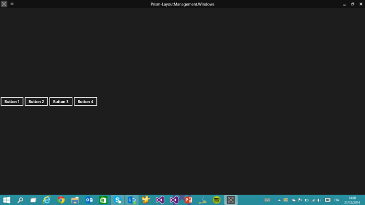
The page simply contains four Button controls, which are placed inside a StackPanel which Orientation property is set to Horizontal. This means that, when the page is displayed using the default layout (which is the landscape mode), the four buttons are displayed one near the other. Our goal is to change this layout so that, when the application is used in portrait mode, the buttons are displayed one below the other.

Let’s introduce the VisualStateManager, which is the class that is able to manage the different visual states of a control. Each visual state matches one of the possible status of the control: for example, the Button control uses a visual state to define how it should look like when it’s pressed. As we’ve already mentioned, the best advantage of this approach is that we won’t have to define the whole layout of the control every time, but it’s enough to define the differences between one state and the other. For example, the Pressed state of the Button control simply specifies that, compared to the standard layout, the background of the button should be white instead of black, while the text should be black instead of white.

We use the same approach to manage the different layouts of the page: inside the VisualStateManager we’ve added inside the main Grid, we add a list of VisualState items, each one with a specific name that follows the Prism conventions. The standard one is called DefaultLayout: it’s empty, since it’s the base definition of the page. Then we create a new one for the portrait mode, which name is PortraitLayout: inside it, by using animations, we specify the differences with the default layout. In our sample, we define a Storyboard with a single ObjectAnimationUsingKeyFrames animation, which simply changes the value of the Orientation property of the StackPanel: from Horizontal to Vertical. If we would have needed to change other controls, we would have simply added other animations inside the Storyboard.

If you want to test the code we’ve written, you can use the Windows 8 simulator: in the Debug dropdown menu, simply choose Simulator instead of Local machine. The simulator, in fact, offers an option to simulate the rotation of the device, which is very useful if you’re developing and testing your application on a traditional computer.

layout1


layout2

Managing the resize of the application

If you’re a Windows 8 user, you should be familiar with the concept of “snapped”: you have the chance to keep multiple applications opened at the same time and to place them side by side. In Windows 8.1, this feature has been improved: if, in Windows 8, the snapped view had a fixed size, in Windows 8.1 the user is able to resize the width of the application to virtually any size, until it reaches a minimum width (by default it’s 500px, but it could be changed to 320px).

As developers, we need to correctly manage this scenario, so that we can provide a good user experience, regardless of the size of the application. The first step to achieve this goal is to create a fluid layout, by using controls (like Grid) that are able to adapt their content to the window’s size. This way, if the user resizes the application, the layout will automatically adapt to display as more content as possible. If you’re familiar with web development, this approach is very similar to the responsive design concept that applies to websites, so that they can automatically adapt to the screen’s size (pc, tablets, smartphones, etc.).

However, this step isn’t enough: if the application’s window becomes too small, it can be hard to display the content by using the same layout and control we’re using with the standard layout. The easiest way to manage this scenario is to use, again, visual states: when the application’s size goes below a minimum width that, according to our design, isn’t enough anymore to properly display the content, we switch to another layout.

This goal is reached in the same way we’ve seen before to manage the portrait mode: by defining a new visual state, identified by the key MinimalLayout, with the difference with the default layout. Let’s take a look at the following sample:

<storeApps:VisualStateAwarePage
    x:Class="Prism_LayoutManagement.Views.MinimumWidthPage"
    xmlns="http://schemas.microsoft.com/winfx/2006/xaml/presentation"
    xmlns:x="http://schemas.microsoft.com/winfx/2006/xaml"
    xmlns:local="using:Prism_LayoutManagement.Views"
    xmlns:d="http://schemas.microsoft.com/expression/blend/2008"
    xmlns:mc="http://schemas.openxmlformats.org/markup-compatibility/2006"
    xmlns:storeApps="using:Microsoft.Practices.Prism.StoreApps"
    xmlns:mvvm="using:Microsoft.Practices.Prism.Mvvm"
    mvvm:ViewModelLocator.AutoWireViewModel="True"
    mc:Ignorable="d">

    <storeApps:VisualStateAwarePage.Resources>
        <CollectionViewSource Source="{Binding Path=Persons}" x:Name="PersonsCollection"/>
    </storeApps:VisualStateAwarePage.Resources>

    <Grid Background="{ThemeResource ApplicationPageBackgroundThemeBrush}">
        <VisualStateManager.VisualStateGroups>
            <VisualStateGroup>
                <VisualState x:Name="DefaultLayout"/>
                <VisualState x:Name="MinimalLayout">
                    <Storyboard>
                        <ObjectAnimationUsingKeyFrames Storyboard.TargetName="GridPersons"
                                                   Storyboard.TargetProperty="Visibility">
                            <DiscreteObjectKeyFrame KeyTime="0" Value="Collapsed" />
                        </ObjectAnimationUsingKeyFrames>
                        <ObjectAnimationUsingKeyFrames Storyboard.TargetName="ListPersons"
                                                   Storyboard.TargetProperty="Visibility">
                            <DiscreteObjectKeyFrame KeyTime="0" Value="Visible" />
                        </ObjectAnimationUsingKeyFrames>
                    </Storyboard>
                </VisualState>
            </VisualStateGroup>
        </VisualStateManager.VisualStateGroups>

        <GridView ItemsSource="{Binding Source={StaticResource PersonsCollection}}" SelectionMode="None" IsItemClickEnabled="True"
                  Margin="120, 0, 12, 0" x:Name="GridPersons" >
            <GridView.ItemTemplate>
                <DataTemplate>
                    <Grid HorizontalAlignment="Left" Width="250" Height="250">
                        <Border Background="{ThemeResource ListViewItemPlaceholderBackgroundThemeBrush}">
                            <Image Source="{Binding ImagePath}" Stretch="UniformToFill" AutomationProperties.Name="{Binding Title}"/>
                        </Border>
                        <StackPanel VerticalAlignment="Bottom" Background="{ThemeResource ListViewItemOverlayBackgroundThemeBrush}" Orientation="Horizontal">
                            <TextBlock Text="{Binding Name}" Foreground="{ThemeResource ListViewItemOverlayForegroundThemeBrush}" Style="{StaticResource TitleTextBlockStyle}" Height="60" Margin="15,0,15,0"/>
                            <TextBlock Text="{Binding Surname}" Foreground="{ThemeResource ListViewItemOverlayForegroundThemeBrush}" Style="{StaticResource TitleTextBlockStyle}" Height="60" Margin="15,0,15,0"/>
                        </StackPanel>
                    </Grid>
                </DataTemplate>
            </GridView.ItemTemplate>
            <GridView.ItemsPanel>
                <ItemsPanelTemplate>
                    <ItemsWrapGrid GroupPadding="0,0,70,0"/>
                </ItemsPanelTemplate>
            </GridView.ItemsPanel>
        </GridView>

        <ListView ItemsSource="{Binding Source={StaticResource PersonsCollection}}" 
                  Visibility="Collapsed"
                  x:Name="ListPersons">
            <ListView.ItemTemplate>
                <DataTemplate>
                    <StackPanel VerticalAlignment="Bottom" Background="{ThemeResource ListViewItemOverlayBackgroundThemeBrush}" Orientation="Horizontal">
                        <TextBlock Text="{Binding Name}" Foreground="{ThemeResource ListViewItemOverlayForegroundThemeBrush}" Style="{StaticResource TitleTextBlockStyle}" Height="60" Margin="15,0,15,0"/>
                        <TextBlock Text="{Binding Surname}" Foreground="{ThemeResource ListViewItemOverlayForegroundThemeBrush}" Style="{StaticResource TitleTextBlockStyle}" Height="60" Margin="15,0,15,0"/>
                    </StackPanel>
                </DataTemplate>
            </ListView.ItemTemplate>
        </ListView>
    </Grid>
</storeApps:VisualStateAwarePage>

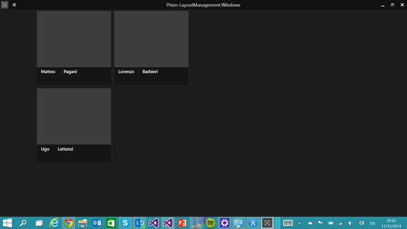
The page contains two controls to display collections: GridView and ListView. Then, in the page resources, I’ve defined a CollectionViewSource object, which is connected to a collection in the ViewModel. As you can see, both controls are connected to the same CollectionViewSource: the result is that both of them are displaying the same data. However, there’s an important difference: by default, the GridView control is displayed, while the ListView one is hidden (you can notice that the Visibility property is set to Collapsed). This means that, when the application is used in full screen, we display the data using a GridView control, which fits best this scenario, since it uses a horizontal navigation approach.

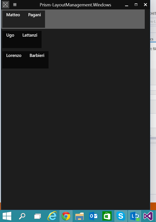
The VisualStateManager in the page, however, defines a visual state called MinimalLayout, which executes two animations, which interact with the Visibility property of the controls: the first one hides the GridView, while the second one displays the ListView. This way, when the application is resized to a size that would make the GridView impossible to use and read, we switch to a ListView control, which instead is easier to use also with a small size, since it displays the data with a vertical layout.

By default, the minimum width is set to 500px: this means that, when the application is resized to less than 500px, the MinimalLayout visual state will trigger. Vice versa, when the size of the application goes back to 500px or more, the DefaultLayout is restored. If you want to change this value, it’s enough to change a property offered by the VisualStateAwarePage class called MinimalLayoutWidth. The following sample shows how to set it, in the XAML, to change the minimum width to 800px:

<storeApps:VisualStateAwarePage
    x:Class="Prism_LayoutManagement.Views.MinimumWidthPage"
    xmlns="http://schemas.microsoft.com/winfx/2006/xaml/presentation"
    xmlns:x="http://schemas.microsoft.com/winfx/2006/xaml"
    xmlns:local="using:Prism_LayoutManagement.Views"
    xmlns:d="http://schemas.microsoft.com/expression/blend/2008"
    xmlns:mc="http://schemas.openxmlformats.org/markup-compatibility/2006"
    xmlns:storeApps="using:Microsoft.Practices.Prism.StoreApps"
    xmlns:mvvm="using:Microsoft.Practices.Prism.Mvvm"
    mvvm:ViewModelLocator.AutoWireViewModel="True"
    MinimalLayoutWidth="800"
    mc:Ignorable="d">

    <!-- content of the page -->  

</storeApps:VisualStateAwarePage>

If you want to play with this feature remember that, by default, the minimum width of the Windows Store app is 500px: this means that, by default, you won’t be able to trigger the visual state, since you can’t resize the application to less than 500px. However, in the manifest file, in the Application section, you’ll find an option called Minimum width that will enable to you to change it to 320 px (which was the size of the old snapped view in Windows 8).

layout3

layout4

Wrapping up

As you usual, you can find the sample project used for this post on GitHub at https://github.com/qmatteoq/Prism-UniversalSample. Just remember that, this demo only, will contain just the Windows 8.1 demo, since the feature described in this post works only in Windows 8.1.

Index of the posts about Prism and Universal Windows apps

  1. The basic concepts
  2. Binding and commands
  3. Advanced commands
  4. Navigation
  5. Managing the application’s lifecycle
  6. Messages
  7. Layout management

Sample project: https://github.com/qmatteoq/Prism-UniversalSample

Posted in Universal Apps, wpdev | Tagged , , | Leave a comment

Prism and Universal Windows apps – Messages

Another common scenario when you work with the MVVM pattern is messages support: all the available toolkits and frameworks support them. Messages are a way to exchange data between two classes (typically, two ViewModels) with a decoupled approach: the two classes won’t have to know each other and you won’t need a common reference. One ViewModel will simply send a message, then other ViewModels can register to receive that message’s type. Messages are, at the end, simple classes, which can hold some data that can be passed from one ViewModel to another.

In Prism, messages are named events: when a ViewModel needs to send some data to another one, it publishes an event; when a ViewModel wants to receive that data, it subscribes for that event. The “postman” that takes care of managing all the infrastructure and of dispatching the events is a class called EventAggregator, which is not included in the base Prism package: you’ll have to install from NuGet a specific package called Prism.PubSubEvents.

After you’ve installed it in both in the Windows and the Windows Phone project, you’ll have to register the EventAggregator object in the App class, in the same way we did in the previous posts for the NavigationService and the SessionStateService classes: this way, we’ll be able to use the EventAggregator class simply by adding an IEventAggregator parameter to the ViewModel’s constructor, thanks to the dependency injection. We register it in the OnInitializeAsync() method of the App class, like in the following sample:

protected override Task OnInitializeAsync(IActivatedEventArgs args)
{
    // Register MvvmAppBase services with the container so that view models can take dependencies on them
    _container.RegisterInstance<ISessionStateService>(SessionStateService);
    _container.RegisterInstance<INavigationService>(NavigationService);
    _container.RegisterInstance<IEventAggregator>(new EventAggregator());
    // Register any app specific types with the container

    // Set a factory for the ViewModelLocator to use the container to construct view models so their 
    // dependencies get injected by the container
    ViewModelLocationProvider.SetDefaultViewModelFactory((viewModelType) => _container.Resolve(viewModelType));
    return Task.FromResult<object>(null);
}

To see how to use events in Prism, we’re going to implement a simple application to display a list of persons: the main page will contain a ListView control, that will display a list of Person objects. The page will contains also a button, in the application bar, to go to an insert page, with a simple form to add a new person to the collection. After the user has filled the name and surname of the user and he has pressed the Save button, we’re going to add the new item in the collection in the main page. We’re going to achieve this goal by using events: when the user presses the Save button, we’re going to send a message to the ViewModel of the main page with the just created person; in the ViewModel of the main page, instead, we’re going to subscribe to this event: when it’s triggered, we’re going to retrieve the new person and add it to the collection displayed in the page.

The first step to implement this scenario is to create a class that identifies our event, like in the following sample:

public class AddPersonEvent : PubSubEvent<Person>
{
}

As you can see, the class is very simple, since it doesn’t contain any property or constructor: the only requirement is to inherit it from the PubSubEvent<T> class, where T is the type of the object we want to pass inside the message. In this sample, we’re going to pass a Person object.

The next step is to define the sender and the receiver of the message: in our case, the sender will be the ViewModel of the add page, while the receiver will be the ViewModel of the main page. Let’s start to see the ViewModel of the main page:

public class MainPageViewModel : ViewModel
{
    private readonly INavigationService _navigationService;
    private readonly IEventAggregator _eventAggregator;

    private ObservableCollection<Person> _persons;

    public ObservableCollection<Person> Persons
    {
        get {return _persons;}
        set { SetProperty(ref _persons, value); }
    }  

    public MainPageViewModel(INavigationService navigationService, IEventAggregator eventAggregator)
    {
        _navigationService = navigationService;
        _eventAggregator = eventAggregator;

        _eventAggregator.GetEvent<AddPersonEvent>().Subscribe(person =>
        {
            if (Persons == null)
            {
                Persons = new ObservableCollection<Person>();
            }

            Persons.Add(person);
        }, ThreadOption.UIThread);

        GoToAddPageCommand = new DelegateCommand(() =>
        {
            _navigationService.Navigate("Add", null);
        });
    }

    public DelegateCommand GoToAddPageCommand { get; private set; }
}


You can notice that, other than an INavigationService parameter (which we already met in another post), we have added a reference to the IEventAggregator class, which we’re going to use to send and receive events. In this case, since we’re in the receiver ViewModel, we’re going to subscribe to the event we’ve previously defined: we do it in the ViewModel’s constructor. The first step is to get a reference to the event we want to manage, by using the GetEvent<T> method, where T is the event’s type (in our case, it’s the AddPersonEvent class we’ve previously created). Then, since in this case we want to receive it, we call the Subscribe() message, which accepts the action that we want to execute when the event is triggered. As action’s parameter, we get the content of the message (in our case, it’s a Person object): in the sample, we simply add the Person object we’ve received to a collection called Persons, which is connected to a ListView control in the page. Optionally, we can pass a second parameter to the Subscribe() method to specify in which thread we want to manage the event: in this case, since we’re updating a control in the View, we manage it in the UI thread (ThreadOption.UIThread). Otherwise, we could have used ThreadOption.BackgroundThread to manage it in background: this approach is useful if we need to execute CPU consuming operations that don’t need to interact with the View.

The ViewModel defines also a DelegateCommand, which simply redirects the user to the Add page that simply contains a couple of TextBox controls and a button to save the data. Here is its definition:

<storeApps:VisualStateAwarePage
    x:Class="Prism_Messages.Views.AddPage"
    xmlns="http://schemas.microsoft.com/winfx/2006/xaml/presentation"
    xmlns:x="http://schemas.microsoft.com/winfx/2006/xaml"
    xmlns:local="using:Prism_Messages.Views"
    xmlns:d="http://schemas.microsoft.com/expression/blend/2008"
    xmlns:mc="http://schemas.openxmlformats.org/markup-compatibility/2006"
    xmlns:mvvm="using:Microsoft.Practices.Prism.Mvvm"
    xmlns:storeApps="using:Microsoft.Practices.Prism.StoreApps"
    mc:Ignorable="d"
    mvvm:ViewModelLocator.AutoWireViewModel="True"
    Background="{ThemeResource ApplicationPageBackgroundThemeBrush}">

    <Grid>
        <StackPanel Margin="12, 0, 0, 12">
            <TextBox PlaceholderText="Name" Header="Name" Text="{Binding Path=Name, Mode=TwoWay, UpdateSourceTrigger=PropertyChanged}" />
            <TextBox PlaceholderText="Surname" Header="Surname" Text="{Binding Path=Surname, Mode=TwoWay, UpdateSourceTrigger=PropertyChanged}" />
        </StackPanel>
    </Grid>

    <Page.BottomAppBar>
        <CommandBar>
            <CommandBar.PrimaryCommands>
                <AppBarButton Label="Save" Icon="Save" Command="{Binding Path=SaveCommand}" />
            </CommandBar.PrimaryCommands>
        </CommandBar>
    </Page.BottomAppBar>
</storeApps:VisualStateAwarePage>

Let’s see now the most interesting part, which is the ViewModel of the Add page:

public class AddPageViewModel : ViewModel
{
    private readonly INavigationService _navigationService;
    private readonly IEventAggregator _eventAggregator;

    private string _name;

    public string Name
    {
        get { return _name; }
        set { SetProperty(ref _name, value); }
    }

    private string _surname;

    public string Surname
    {
        get { return _surname; }
        set { SetProperty(ref _surname, value); }
    }

    public AddPageViewModel(INavigationService navigationService, IEventAggregator eventAggregator)
    {
        _navigationService = navigationService;
        _eventAggregator = eventAggregator;

        SaveCommand = new DelegateCommand(() =>
        {
            Person person = new Person
            {
                Name = this.Name,
                Surname = this.Surname
            };

            _eventAggregator.GetEvent<AddPersonEvent>().Publish(person);
            _navigationService.GoBack();
        });
    }


    public DelegateCommand SaveCommand { get; private set; }
}

In this sample we see the other usage of the EventAggregator class, which is publishing an event: we use it in the SaveCommand, which is triggered when the user presses the Save button in the page. The first step, also in this case, is to get a reference to the event, by calling the GetEvent<T>() method. However, in this situation, we’re going to use the Publish() method, which sends the message: as parameter, we need to pass the data that is supported by the event (in our case, the AddPersonEvent supports a Person’s parameter). In the end, we call the GoBack() method of the NavigationService, to redirect the user back to the main page.

If we launch the application, we’ll notice that, after pressing the Save button in the Add page, the user will be redirected to the main page and the just created Person object will be displayed in the list. If we set some breakpoints in the MainPageViewModel and in the AddPageViewModel classes, we’ll notice that the messages are successfully exchanged between the two ViewModels.

Wrapping up

As usual, you can download the sample project used in this post on GitHub at https://github.com/qmatteoq/Prism-UniversalSample

Index of the posts about Prism and Universal Windows apps

  1. The basic concepts
  2. Binding and commands
  3. Advanced commands
  4. Navigation
  5. Managing the application’s lifecycle
  6. Messages
  7. Layout management

Sample project: https://github.com/qmatteoq/Prism-UniversalSample

Posted in Universal Apps, wpdev | Tagged , , | Leave a comment