Telerik and Windows Phone 8 – The JumpList (Grouping)

Telerik is a very well known company by Microsoft developers, since it develops probably the best components and controls for .NET technologies.  Its relationship with Microsoft developers started a long time ago, since, in their catalogue, you can find controls for “old” technologies like Windows Forms.

It’s a commercial company: their controls suites aren’t free, even if Telerik is a company that has a strong relationships with communities, so it’s not rare to receive free licenses during events and conferences. But, recently, their Windows Phone suite has started to gain a lot of interest among Windows Phone developers for many reasons:

  • The quality of the provided controls is very high: they can make your life easier and they almost fully support binding (even when standard controls doesn’t), so they are a good companion for MVVM apps.
  • Telerik suites, usually, have a high price, because they include all the available controls developed by the company. But, since Windows Phone is gaining a lot of interest also from hobbyst and students, Telerik has decided to sell at 99$ just the Windows Phone controls, without having to buy the full suite: for this reason, the price is affordable also if you’re not a professional.
  • As I’ve already mentioned in this blog, Nokia has created a new program called Nokia Premium Developer which, at the same price of the standard Microsoft Store registration (99 $), it includes a token to create or renew a Store account, a certain number of API calls for the Buddy’s API services and, guess what, a Telerik license!

For these reasons, and due to my recent experience with the suite (I used it in my latest projects), I’ve decided to write some blog posts to show you how to use some of the controls that are part of the toolkit and how they can improve your work.

Le’t start with the JumpList!

The JumpList control

Lists are one of the key part of every Windows Phone application: it’s almost impossible to find an application that doesn’t need to display a collection of data. Originally Windows Phone 7 included just the ListBox control for this scenario, that had many limitations and performance problems. Things are changed now, since Windows Phone 8 includes a control called LongListSelector (that, previously, was part of the Phone Toolkit), that has much better performances and that supports features like grouping and sorting.

But things are still not perfect: the LongListSelector doesn’t support features that are, instead, widely used by the platform itself, like sticky headers or multiple selection. Plus, the approach to group your data is not very simple: it requires to create a separate class to manage them and to change your collection, like it’s described in this MSDN article.

For this reason Telerik has included in the RadControls for Windows Phone suite a control called RadJumpList, which goal is to overcome the limitations of the original LongListSelector control. Let’s see how to implement some scenarios with the RadJumpList control.

Grouping data

Grouping is one of the features that is widely used also by the native operating system: just think at the People hub, where contacts are grouped by their initial, so that the user can easily jump from a letter to another. The RadJumpList control makes very easy to group your data in the same way and, most important, it doesn’t require you to change your original collection: with the LongListSelector control, in fact, instead of just setting your collection as ItemsSource property of the control, you have first to group your data. With RadJumpList, instead, you can keep using your original collection, where items are not grouped: grouping will be added in a second step. Let’s start with a simple example: we have a collection of people, that we want to display in the application. Every person is mapped with a specific class:

public class Person
{
    public string Name { get; set; }
    public string Surname { get; set; }
    public string City { get; set; }
}

Let’s start by adding the control in the XAML (you’ll need to declare the following namespace xmlns:telerikDataControls=”clr-namespace:Telerik.Windows.Controls;assembly=Telerik.Windows.Controls.Data” in the PhoneApplicationPage node in the XAML).

<telerikDataControls:RadJumpList x:Name="People">
    <telerikDataControls:RadJumpList.ItemTemplate>
        <DataTemplate>
            <StackPanel>
                <TextBlock Text="{Binding Path=Name}" />
                <TextBlock Text="{Binding Path=Surname}" />
            </StackPanel>
        </DataTemplate>
    </telerikDataControls:RadJumpList.ItemTemplate>
</telerikDataControls:RadJumpList>

As you can see, for the basic use there are no differences with a standard ListBox or LongListSelector: we define an ItemTemplate, which is the template that will be used to show every item of the collection. In this sample, we simply display the Name and Surname properties of the person.

In the code behind, we’re going to load some data as we’ve already used to do with a ListBox:

public MainPage()
{
    InitializeComponent();

    // Sample code to localize the ApplicationBar
    //BuildLocalizedApplicationBar();

    ObservableCollection<Person> people = new ObservableCollection<Person>
        {
            new Person
                {
                    Name = "Matteo",
                    Surname = "Pagani",
                    City = "Como"
                },
            new Person
                {
                    Name = "Ugo",
                    Surname = "Lattanzi",
                    City = "Milan"
                },
            new Person
                {
                    Name = "Mario",
                    Surname = "Rossi",
                    City = "Milan"
                }
        };

    People.ItemsSource = people;
}

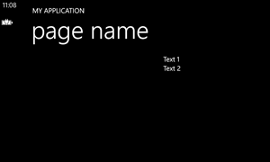
Nothing special here: if you launch the application, you’ll see the list of people displayed in the RadJumpList control.

But if we want grouping? We need to interact with the GroupDescriptors property of the RadJumpList control, that can be used to set how we want to group our data. Let’s say we want to group our contacts by city. Here is the code we need to add before setting the ItemsSource property of the RadJumpList control.

GenericGroupDescriptor<Person, string> group = new GenericGroupDescriptor<Person, string>();
group.KeySelector = (person) =>
    {
        return person.City;
    };

People.GroupDescriptors.Add(group);

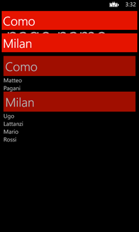
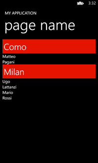
Easy, isn’t it? We just need to define a new GenericGropDescriptor<T, Y> object, where T is the base class of our collection (in this case, Person), while Y is the property’s type we want to use for grouping (in our sample, City, that is a string). Then we assign a function to the KeySelector property, that is the way we want to group our data. This function features, as parameter, the object’s type of our collection (in our case, Person), so we simply need to return, as result, the field we want to use for grouping (City). In the end, we add the GenericGroupDescriptor object to the GroupDescriptors collection of the RadJumpList control. And that’s it! Now launch the application and you’ll see your data grouped by city: plus, the group headers will be interactive, so that the user can tap on them and jump directly to the selected group.

jumplist1jumplist2


Sorting

Sorting your data is really easy and RadJumpList supports two way of sorting: by group and by item. The two things can be combined, so that you can have your groups ordered with a criteria and the items inside that group ordered for another one. Sorting the groups is really easy: the GenericGroupDescriptor class we’ve just seen supports a property called SortMode, that accepts one of the values of the ListSortMode enumerator: Ascending, Descending and None.

GenericGroupDescriptor<Person, string> group = new GenericGroupDescriptor<Person, string>();
group.SortMode = ListSortMode.Ascending;
group.KeySelector = (person) =>
    {
        return person.City;
    };

People.GroupDescriptors.Add(group);

This type of sorting applies just to the order in which groups are displayed in the list and it doesn’t affect the elements inside every group: if you try to change, for example, the SortMode to ListSortMode.Descending, you’ll see that the group labeled Milan will be displayed before the one labeled Como, but the order of the contacts inside every group won’t change.

If you want to apply a specific order also for the contacts, you’ll have to use a GenericSortDescriptor<T, Y> object, that works exactly like the GenericGroupDescriptor one. The only difference is that, in this case, as value of the KeySelector property we will pass a function that returns the property we want to use to order the items.

GenericSortDescriptor<Person, string> sort = new GenericSortDescriptor<Person, string>();
sort.SortMode = ListSortMode.Ascending;
sort.KeySelector = person =>
    {
        return person.Name;
    };

People.SortDescriptors.Add(sort);

In this sample we want to order the contacts by name: after we’ve set up our GenericSortDescriptor object, we add it to another special collection exposed by the RadJumpList control, that is called SortDescriptors. This sorting is independant from the grouping one: if you try to change the SortMode to ListSortMode.Descending you’ll notice that the groups order won’t change, but the order of the contacts inside every group will be different.

Grouping and sorting with MVVM

Using grouping and sorting in an application built with the MVVM pattern it’s easy, since the RadJumpList control exposes two properties called GroupDescriptorsSource and SortDescriptorsSource, that support binding. They accept a collection as input, so you’ll have to create in your ViewModel two collections to hold the GenericGroupDescriptor or GenericSortDescriptor criterias you want to apply (even if you’re going to add just one criteria).

Here is a sample of a ViewModel:

public class MainViewModel: INotifyPropertyChanged
{
    private ObservableCollection<GenericGroupDescriptor<Person, string>> groupDescriptors;

    public ObservableCollection<GenericGroupDescriptor<Person, string>> GroupDescriptors
    {
        get { return groupDescriptors; }
        set
        {
            groupDescriptors = value;
            OnPropertyChanged("GroupDescriptors");
        }
    }

    private ObservableCollection<GenericSortDescriptor<Person, string>> sortDescriptors;

    public ObservableCollection<GenericSortDescriptor<Person, string>> SortDescriptors
    {
        get { return sortDescriptors; }
        set
        {
            sortDescriptors = value;
            OnPropertyChanged("SortDescriptors");
        }
    }

    public MainViewModel()
    {
        GroupDescriptors = new ObservableCollection<GenericGroupDescriptor<Person, string>>();
        SortDescriptors = new ObservableCollection<GenericSortDescriptor<Person, string>>();

        GenericGroupDescriptor<Person, string> group = new GenericGroupDescriptor<Person, string>();
        group.SortMode = ListSortMode.Ascending;
        group.KeySelector = (person) =>
            {
                return person.City;
            };

        GroupDescriptors.Add(group);

        GenericSortDescriptor<Person, string> sort = new GenericSortDescriptor<Person, string>();
        sort.SortMode = ListSortMode.Ascending;
        sort.KeySelector = person =>
            {
                return person.Name;
            };

        SortDescriptors.Add(sort);
    }

    public event PropertyChangedEventHandler PropertyChanged;

    [NotifyPropertyChangedInvocator]
    protected virtual void OnPropertyChanged([CallerMemberName] string propertyName = null)
    {
        PropertyChangedEventHandler handler = PropertyChanged;
        if (handler != null) handler(this, new PropertyChangedEventArgs(propertyName));
    }
}

As you can see, we simply use the same code we’ve seen before but, instead of adding the generic descriptors directly to the RadJumpList control, we add them to two collections exposed by the ViewModel. Then, in the XAML, we use binding to connect them to the RadJumpList control:

<telerikDataControls:RadJumpList x:Name="People" GroupDescriptorsSource="{Binding Path=GroupDescriptors}" SortDescriptorsSource="{Binding Path=SortDescriptors}">
    <telerikDataControls:RadJumpList.ItemTemplate>
        <DataTemplate>
            <StackPanel>
                <TextBlock Text="{Binding Path=Name}" />
                <TextBlock Text="{Binding Path=Surname}" />
            </StackPanel>
        </DataTemplate>
    </telerikDataControls:RadJumpList.ItemTemplate>
</telerikDataControls:RadJumpList>

In the next posts

In the next posts we’ll see some other features of the RadJumpList control: how to use sticky headers, multiple selection and how to customize grouping. Meanwhile, you can play with the sample project (obviously, the Telerik libraries are missing, since they can’t be redistributed, you’ll need to manually add your own ones).

Posted in Windows Phone | Tagged , , | 8 Comments

How to override the theme of a custom Application Bar

I recently published a big update for an application I’ve developed a long time ago and that I “abandoned” until today: Speaker Timer. It’s a simple application for speakers, that can be used to track the time of your speech and to immediately see if you’re exceeding or not the time you’ve been assigned.

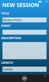
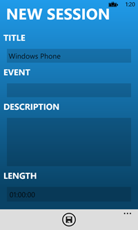
During the development I’ve encountered some issues to correctly manage the phone’s theme: as you can see from the screenshot on the Store, the application has a blue background and white texts. For this reason, everything works fine when the app is used with the dark theme but, if the user is using the light one, things start to get messy: texts starts to get hard to read and the overall user experience is really bad. In the following screenshots you can see, on the left, the application with the dark theme and, on the right, with the light theme: as you can see, since texts are in black over a blue background, they aren’t easy to read.

session2session1

Luckily Jeff Wilcox, that works in Microsoft as leader of the Windows Azure SDK and many other open source projects, has developed a really great library called PhoneThemeManager, that is described in this blog post. The purpose of this library is really simple: with one line of code you’re able to force a specific theme in your application so that, if your application looks bad with another theme because you’ve used custom colors, you can force all the elements in the page to use your own theme.

Once you’ve installed the library using NuGet, you’ll just have to use the singleton ThemeManager class when your application starts (it can be inside the App.xaml.cs constructor or, for example, since Speaker Timer is built using Calibur Micro, I used it in the OnStartup() method of the boostrapper).

This class exposes some methods to change the theme: the most important ones are ToDarkTheme() and ToLightTheme(), that will override every color and force all the elements to use the theme that matches best with your application. In my case, since Speaker Timer looks bad with a light theme, I’ve forced the dark theme by including the following code:

public App()
{
    // Standard Silverlight initialization
    InitializeComponent();

    ThemeManager.ToDarkTheme();

    // Show graphics profiling information while debugging.
    if (System.Diagnostics.Debugger.IsAttached)
    {
        // Display the current frame rate counters.
        Application.Current.Host.Settings.EnableFrameRateCounter = false;

        // Show the areas of the app that are being redrawn in each frame.
        //Application.Current.Host.Settings.EnableRedrawRegions = true;

        // Enable non-production analysis visualization mode, 
        // which shows areas of a page that are being GPU accelerated with a colored overlay.
        //Application.Current.Host.Settings.EnableCacheVisualization = true;
    }
}

The result, with this simple code, is that, regardless of the theme chosen by the user, the application will always look like in the first screenshot.

Managing a custom Application Bar

As I’ve already mentioned, Speaker Timer is developed using Caliburn Micro as a MVVM Framework: for this reason, I’m not using the native Application Bar, but the one I’ve talked about in this post, that supports binding and Caliburn Micro conventions. However, by using this bar I’ve found an issue connected to the user theme: even if I’ve forced the dark theme using Jeff Wilcox’s library, the application bar was still using the light theme. It’s not a big deal, but the biggest issue was that, when I moved to the other pages and then I came back to the first one, the Application Bar suddendly changed and became dark. This happens because the PhoneThemeManager library can’t immediately ovveride the Application Bar colors, so you can see the change only at a second time.

How to fix this situation? The library exposes two methods for this scenario: the first one is called CreateApplicationBar() and can be used to create a new application bar with the proper theme. This method is useful in case you’re creating and managing the Application Bar in the code behind and not in the XAML. But this is not my case, since Speaker Timer is built using MVVM and the custom application bar is added directly in the XAML. Here comes another method offered by the library, called MatchOverriddenTheme(): it’s an extension method applied to the IApplicationBar interface, so every custom Application Bar implemention should support it. When you call this method, the application bar colors are immediately overwritten, so you don’t have to deal with the graphic glitch I’ve mentioned before.

There’s only one important thing to keep in mind: this method should be called in the Loaded event of every page with an application bar and not in the page costructor, otherwise it won’t work properly, as you can see in the following screenshot.

glitch

So, the first operation is to give a Name to your custom application bar using the x:Name property, like in the following sample:

<bindableAppBar:BindableAppBar x:Name="AppBar">
    <bindableAppBar:BindableAppBarButton Text="{Binding Source={StaticResource LocalizedStrings}, Path=LocalizedResources.Add}" IconUri="/Assets/Icons/Add.png" 
                                         x:Name="NewSession" 
                                         Visibility="{Binding Path=IsCheckModeEnabled, Converter={StaticResource NegativeBooleanToVisibilityConverter}}" />

    <bindableAppBar:BindableAppBarButton Text="{Binding Source={StaticResource LocalizedStrings}, Path=LocalizedResources.Select}" IconUri="/Assets/Icons/Selection.png"
                                         x:Name="Selection"
                                         Visibility="{Binding Path=IsCheckModeEnabled, Converter={StaticResource NegativeBooleanToVisibilityConverter}}" />
</bindableAppBar:BindableAppBar>


Then, in the code behind, you should subscribe to the Loaded event and call the MatchOverriddenTheme() on the custom application bar, like in the following sample:

public partial class MainPage : PhoneApplicationPage
{
    // Constructor
    public MainPage()
    {
        InitializeComponent();
        Loaded += (obj, args) =>
            {
                AppBar.MatchOverriddenTheme();
            };
    }
}

That’s all! Happy coding!

Posted in Windows Phone | Tagged | Leave a comment

How to manage orientation in Windows Phone using VisualStateManager

When I started to play with Windows Store apps development for Windows 8, one of the things I liked most was the base LayoutAwarePage class, from which every page inherits from. This class introduces a built in support for managing the different visual states of the page using the VisualStateManager: every time the page state changes (Portrait, Landscape, Snapped or Filled), a specific state is triggered so, as a developer, it’s really easy to apply animation and changes the layout of the page.

Unfortunately, this built in helper is missing in Windows Phone, so you have to manually manage the orientation from portrait to landscape or vice versa: Windows Phone is able to, automatically, arrange the controls when the orientation is changed, but often isn’t enough because you want to deeply change the layout of the page according to the orientation.

So I googled a little bit and I’ve found that a talented developer that has a blog called Tomahawk’s blog (I wasn’t able to find the real developer name, if you contact me I’ll be more than happy to update the post) has developed a really nice extension, that can be used to recreate the same approach I’ve described in Windows 8 in both Windows Phone 7 and 8 applications.

Let’s see how to use it. Unfortunately, the library isn’t available on NuGet, so you’ll have to download the source project and compile it: you’ll get, in the end, different DLLs, one for each supported platform. For your convenience, in the sample project attached at the end of this post you’ll find the already precompiled libraries.

After you’re created your project, the first modify to do to start supporting orientation is to change the SupportedOrientations property in the XAML: you’ll find it as a property of the PhoneApplicationPage object in XAML, which is the main control that identifies the page. This property tells to the page which orientations are you going to support and, by default, it’s set to Portrait, so the page doesn’t react when the device is rotated in landscape. To enable it, you’ll have to change the value in PortraitOrLandscape.

The second thing is to register, always in the PhoneApplicationPage control, the library: you’ll have to register the namespace of the library (which, for a Windows Phone 8 application is xmlns:orientationHelper=”clr-namespace:OrientationHelper;assembly=OrientationHelper.PhoneRT” while for a Windows Phone 7 one is  xmlns:orientationHelper=”clr-namespace:OrientationHelper;assembly=OrientationHelper.WP7″) and set the property OrientationHelper.IsActive to true.

Here is how it will look like, in the end, the PhoneApplicationHelper declaration of your page:

<phone:PhoneApplicationPage
    x:Class="Orientation.MainPage"
    SupportedOrientations="PortraitOrLandscape" Orientation="Portrait"
    orientationHelper:OrientationHelper.IsActive="True"
    >

Once you’ve completed this steps, automatically the application will start to apply different visual states every time the orientation changes. So, you’ll need to define them in your page, inside the main Grid of the application (the one that is called LayoutRoot in the standard template).

Here is a sample:

<VisualStateManager.VisualStateGroups>
    <VisualStateGroup x:Name="PageOrientationStates">
        <VisualState x:Name="Landscape" />
        <VisualState x:Name="LandscapeLeft" />
        <VisualState x:Name="LandscapeRight" />

        <VisualState x:Name="Portrait" />
        <VisualState x:Name="PortraitUp" />
        <VisualState x:Name="PortraitDown" />
    </VisualStateGroup>
</VisualStateManager.VisualStateGroups>

As you can see, we’ve added a VisualStateGroup which name is PageOrientationStates and, inside it, there’s a specific VisualState for every possible orientation that can be intercepted by the application. This XAML is basically useless: if you use an empty VisualState tag, like in this sample, without specifying anything inside, no changes will be applied and the standard layout of the controls will be used.

What we’re going to do is, inside every VisualState, specifying one or more animations, that will tell to our controls how they should behave or look in portrait or landscape mode: we can change any property of any control, so we can hide them, move them, change alignment or orientation, etc.

Changing value of a property

In this sample we’re going to see a simple animation, that it’s often used because it can be used to simply change the value of a property: it’s perfect if you need to change visibility, alignment, orientation, etc.

We’ll start from a very simple XAML:

<StackPanel x:Name="MainPanel">
    <TextBlock Text="Text 1" />
    <TextBlock Text="Text 2" />
    <TextBlock Text="Text 3" />
    <TextBlock Text="Text 4" />
</StackPanel>

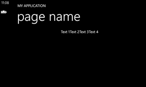
We have four TextBlock controls, inside a StackPanel, so they are displayed one below the other. We want that, in landscape mode, the Orientation property of the panel is changed to Horizontal and that the content is aligned at the center of the page.

The first thing to do is to assign a name to every control we want to change during the animation: in this sample, we’ve assigned the name MainPanel to the StackPanel control, since we want to manipulate its properties.

Here is the VisualStateManager definition to accomplish our task:

<VisualStateManager.VisualStateGroups>
    <VisualStateGroup x:Name="PageOrientationStates">
        <VisualState x:Name="Landscape">
            <Storyboard>
                <ObjectAnimationUsingKeyFrames Storyboard.TargetName="MainPanel" Storyboard.TargetProperty="Orientation">
                    <DiscreteObjectKeyFrame KeyTime="0" Value="Horizontal" />
                </ObjectAnimationUsingKeyFrames>
                <ObjectAnimationUsingKeyFrames Storyboard.TargetName="MainPanel" Storyboard.TargetProperty="HorizontalAlignment">
                    <DiscreteObjectKeyFrame KeyTime="0" Value="Center" />
                </ObjectAnimationUsingKeyFrames>
            </Storyboard>
        </VisualState>
        <VisualState x:Name="LandscapeLeft">
            <Storyboard>
                <ObjectAnimationUsingKeyFrames Storyboard.TargetName="MainPanel" Storyboard.TargetProperty="Orientation">
                    <DiscreteObjectKeyFrame KeyTime="0" Value="Horizontal" />
                </ObjectAnimationUsingKeyFrames>
                <ObjectAnimationUsingKeyFrames Storyboard.TargetName="MainPanel" Storyboard.TargetProperty="HorizontalAlignment">
                    <DiscreteObjectKeyFrame KeyTime="0" Value="Center" />
                </ObjectAnimationUsingKeyFrames>
            </Storyboard>
        </VisualState>
        <VisualState x:Name="LandscapeRight">
            <Storyboard>
                <ObjectAnimationUsingKeyFrames Storyboard.TargetName="MainPanel" Storyboard.TargetProperty="Orientation">
                    <DiscreteObjectKeyFrame KeyTime="0" Value="Horizontal" />
                </ObjectAnimationUsingKeyFrames>
                <ObjectAnimationUsingKeyFrames Storyboard.TargetName="MainPanel" Storyboard.TargetProperty="HorizontalAlignment">
                    <DiscreteObjectKeyFrame KeyTime="0" Value="Center" />
                </ObjectAnimationUsingKeyFrames>
            </Storyboard>
        </VisualState>

        <VisualState x:Name="Portrait" />
        <VisualState x:Name="PortraitUp" />
        <VisualState x:Name="PortraitDown" />
    </VisualStateGroup>
</VisualStateManager.VisualStateGroups>

The animation we’re going to use is called ObjectAnimationUsingKeyFrames, that can be used to change the control’s properties and to specify the exact time of the animation, so that we can control it. In our case, we don’t want a real animation, but just to change the value. For this reason, every animation will have just one frame (identified by the ObjectAnimationUsingKeyFrames object) with the property KeyTime set to 0 (so that the animation will trigger immediately). The ObjectAnimationUsingKeyFrames object is placed inside the object that identifies the real animation, which is called ObjectAnimationUsingKeyFrames: using two attached properties we’re going to set which is the control that we want to animate (Storyboard.TargetName) and which is the property we want to change (Storyboard.TargetProperty). In this sample we’re going to apply two animations: the first one will change the Orientation property, the second one the HorizontalAlignment one. The new value that should be assigned is set as Value property of the DiscreteObjectKeyFrame object. In case the device is rotated in landscape mode, we change the StackPanel’s Orientation to Horizontal and the HorizontalAlignment to Center.

We repeat this for every VisualState that identifies a landscape orientation: Landscape, LandscapeLeft and LandscapeRight. We leave, instead, the portrait VisualStates empty: this way, when the device is rotated back in portrait, the standard layout is restored. This is a good shortcut to avoid creating other animations simply to put back the controls in the original state.

This kind of animation can be used also if you want to totally change the layout when the orientation is changed: since, in these cases, moving, hiding or aligning too many controls can be complex, it’s easier to create two different layouts (inside, for example, two different Grid or StackPanel controls) and, by changing the Visibility property of the panel, hiding or displaying the proper one. This approach works better if you’re developing the application using the MVVM pattern, since you can’t assign the same x:Name property value to two controls. Using binding, instead, you’re able to assign the same property to multiple controls without problems.

object1object2

Moving objects with animations

Another common situation is to move controls with an animation, to change the layout. In this case we can use a DoubleAnimation, which can be used to change one of the properties that has a numeric value, like the width, the height or the font size. To move a control in the page, we need to use a transformation, that are a way to change the layout of the control without having to redefine every property. For example, if we want to move an object in the page we can use a TranslateTransform, that supports changing the X and Y coordinates of the control. We’ll start from a situation similar to the previous sample: we’ have a StackPanel with some TextBlock controls inside.

The first thing is to apply a TranslateTrasform to the StackPanel, so that we can use it in the animation to move the control.

<StackPanel>
    <StackPanel.RenderTransform>
        <TranslateTransform x:Name="PanelTranslate"/>
    </StackPanel.RenderTransform>
    <TextBlock Text="Text 1" />
    <TextBlock Text="Text 2" />
</StackPanel>

In this case, we don’t give a value to the X and Y property of the TranslateTransform object, since we want to keep it in the original position when it’s loaded. We give it just a name, because we’ll need to interact with it when the device is rotated in landscape mode. Here is how we define our VisualStateManager:

<VisualStateManager.VisualStateGroups>
    <VisualStateGroup x:Name="PageOrientationStates">
        <VisualState x:Name="Landscape">
            <Storyboard>
                <DoubleAnimation Storyboard.TargetName="PanelTranslate" Storyboard.TargetProperty="X" To="400" />
            </Storyboard>
        </VisualState>
        <VisualState x:Name="LandscapeLeft">
            <Storyboard>
                <DoubleAnimation Storyboard.TargetName="PanelTranslate" Storyboard.TargetProperty="X" To="400" />
            </Storyboard>
        </VisualState>
        <VisualState x:Name="LandscapeRight">
            <Storyboard>
                <DoubleAnimation Storyboard.TargetName="PanelTranslate" Storyboard.TargetProperty="X" To="400" />
            </Storyboard>
        </VisualState>

        <VisualState x:Name="Portrait" />
        <VisualState x:Name="PortraitUp" />
        <VisualState x:Name="PortraitDown" />
    </VisualStateGroup>
</VisualStateManager.VisualStateGroups>

For every VisualState that refers to a landscape position, we set a DoubleAnimation. Also in this case we need to set which is the control we want to animate (the TranslateTransform object) and which is the property we want to change (the X position). Plus, we define the ending value of the animation using the To property: in this sample, we’re telling that the control should move from the starting position to the coordinate 400 of the X axe.

This kind of approach can be useful when you have some controls which position needs to be rearranged when the device is rotated.

translation1translation2

In the end

This is just one of the available approaches to manage orientations. Another good solution is to use behaviors, like the MVP Andràs Velvàrt explains in his blog post. Personally I like more the approach I’ve described in this post because is similar to the one offered by Windows 8 and Windows Store apps, but it’s up to you to choose what you like best!

Posted in Windows Phone | Tagged | 2 Comments

First steps with Caliburn Micro in Windows Phone 8 – The complete series

This post is simply a collector of all the blog posts I wrote about using Caliburn Micro, a very powerfull Model-View-ViewModel framework, in Windows Phone 8. The posts are listed in chronological order, so it will be easier for you to follow the logic path of the posts: from the basic concepts (what’s Caliburn, conventions, etc.) to the most complex stuff (tombstoning, collections, messaging).

This list will be published also at the bottom of every post of the series, so that it will be easier for you to jump from a post to another.

Here we go!

  1. The theory
  2. The first project
  3. Actions
  4. Collections and navigation
  5. Tombstoning
  6. Advanced navigation and deep links
  7. Messaging
  8. Using launchers and choosers
  9. Use your own services
  10. The Application Bar
  11. Pivot
  12. Lazy loading with pivot
Posted in Windows Phone | Tagged , , | 4 Comments

Backup and restore on Skydrive in Windows Phone 7

I’m working on a big update for my Speaker Timer application and one of the features I’m implementing is Skydrive’s support, to create a backup of the data and restore it in case the user buys a new phone or he has to reset it. There are many tutorials on the web about this scenario, but I think that all of them are missing some crucial information: some tutorials only explain how to upload files on Skydrive and not how to download them; the official documentation explains how to execute a download, but it mentions stuff like “file id” without explaining in details how to get it.

For this reason  I’ve decided to write a tutorial on my own: I hope you’ll find it useful for your applications. Please keep in mind that this tutorial is based on Windows Phone 7: on Windows Phone 8 the approach is really similar, but the Live SDK supports async methods instead of using the callback pattern.

Prepare the environment

The first thing to do is to add the Live SDK to your project, which is the SDK provided by Microsoft to interact with the Live services. You can use it to identify the user, to get some information about it, to access to his remote pictures and so on. One of the supported feature is Skydrive’s access: you can read and write files from the user’s cloud storage. You can download the Live SDK for Windows Phone from the official website or you can simply add it using NuGet.

The second step is to register your application in the Live Developer Portal: this step is required to get access to the Client Id, which is a unique identifier needed by the Live services to identify your application. Once you’ve logged in with your Microsoft Account on the portal click on the My apps section and choose the option Create application.

image

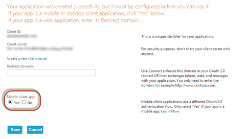
In the first step you have to specify a unique identifier (in the Application Name field) and the primary language of your application. Once you’re ready, click on the I accept button. In the second and final step the only option you do is to specify that you’re developing a mobile application, by choosing Yes in the Mobile client app option. Remember to press Save to confirm.

image

In this page you’ll also get the Client ID, that we’re going to use soon to configure our application.

Sign in with the Microsoft Account

The first operation to do in your application is to add sign in support: the user will have to login to his Microsoft Account before being able to interact with Skydrive. This operation is really simple, since the Live SDK includes a built in control that takes care of all the process. The first thing is to add, in the PhoneApplicationPage declaration in the XAML, the namespace that contains the control:

xmlns:my=”clr-namespace:Microsoft.Live.Controls;assembly=Microsoft.Live.Controls”

Now you are able to add the control in the page, like in the following sample:

<my:SignInButton ClientId="your_client_id" 
    Scopes="wl.signin wl.skydrive_update" 
    Branding="Skydrive" 
    TextType="SignIn" 
    SessionChanged="SignInButton_OnSessionChanged" 
    VerticalAlignment="Top"
/>

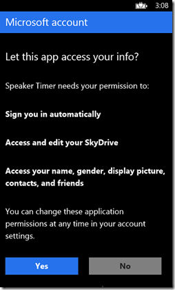
The control is simply a button, that will take care of the all operations needed to do the login: when the user taps on it, a web view is opened, asking for the Microsoft account credentials. Once the login process is completed, in the application you’ll get the information if the login operation is successful or not.

imageimage

The name of the control is SignInButton and it offers many properties to customize it. The most important one is ClientId, which contains the unique identifier of the application that you received after registering your application on the developer portal. One another important option is Scopes, that can be used to specify which features of the Live platform you’re going to use (you can find a list of all the available scopes in this page): in this case we just need wl.signin (that is the basic one, needed to support authentication) and wl.skydrive_update (which is needed to get read and write access to Skydrive). If you want to customize the look & feel of the button you can use the Branding and TextType options: the first one is used to choose the logo that will be displayed on the button (since we’re going to interact with Skydrive, we use the Skydrive option), the second one to choose the login / logout texts that will be used as label (you can also customize them using the SignInText and SignOutText properties).

Now it’s time to write some code: the button offers an event called SessionChanged, that is invoked when the user is interacting with the control and he’s trying to login. Here is how to manage the event in the code:

private void SignInButton_OnSessionChanged(object sender, Microsoft.Live.Controls.LiveConnectSessionChangedEventArgs e)
{
    if (e.Status == LiveConnectSessionStatus.Connected)
    {
        client = new LiveConnectClient(e.Session);
        MessageBox.Show("Connected!");
    }
}

The e parameter contains the status of the operation: with the Status property (which type is LiveConnectSessionStatus) we are able to know if the login operation completed successfully (LiveConnectSessionStatus.Connected). In this case, we can create a new instance of the LiveConnectClient class, which is the base class needed to perform all the operations with the Live services. As parameter you have to pass the identifier of the current session, which is stored in the Session property of the method’s parameters.

Backing up the file

Now that the user is logged in and you have a valid LiveConnectClient object, you’re ready to backup your files on Skydrive. In this sample, we’re going to save a single file in the Skydrive’s root:

private void OnBackupClicked(object sender, RoutedEventArgs e)
{
    client.UploadCompleted += client_UploadCompleted;
    using (IsolatedStorageFile storage = IsolatedStorageFile.GetUserStoreForApplication())
    {
        IsolatedStorageFileStream stream = storage.OpenFile("Sessions.xml", FileMode.Open);
        client.UploadAsync("me/skydrive", "SpeakerTimer.bak", stream, OverwriteOption.Overwrite);
    }
}

void client_UploadCompleted(object sender, LiveOperationCompletedEventArgs e)
{
    if (e.Error == null)
    {
        MessageBox.Show("Upload successfull!");
    }
}

The first thing we do is to subscribe to the UploadCompleted event exposed by the LiveConnectClient class, which is invoked when the upload operation is completed: this is needed because the operation is asynchronous. Then, using the storage APIs, we get the stream of the file we want to backup: in my sample, it’s a file called Sessions.xml stored in the isolated storage’s root. In the end we start the upload operation by calling the UploadAsync() method of the client, which accepts:

  • The path where to save the file on the Skydrive’s storage. With using the “me/skydrive” syntax we’re going to save the file in the Skydrive’s root;
  • The name of the file that will be saved on Skydrive;
  • The stream of the file to save: it’s the one that we’ve retrieved using the OpenFile() method of the IsolatedStorageFile class;
  • What to do in case the file on Skydrive already exists: in our sample we simply overwrite it by using the OverwriteOption.Overwrite value.

When the UploadCompleted event is raised we simply check if an error has occurred, by checking the value of the Error property of the LiveOperationCompletedEventArgs parameter: in case it’s null, we show a message with the notification that the upload has completed successfully. If we did everything correct, we’ll find the file in our Skydrive’s storage.

Restoring the file

The backup operation was very simple to accomplish; the restore operation, instead, is a little bit trickier, because every file and folder on Skydrive is identified by a unique id and you can’t access to the file we’ve uploaded using its name. One way to get it is using the parameters returned by the UploadCompleted method, which contain, in the Result property, a dictionary with all the file’s properties, so by using the following code we are able to retrieve it.

void client_UploadCompleted(object sender, LiveOperationCompletedEventArgs e)
{
    if (e.Error == null)
    {
        string fileId = e.Result["id"].ToString();
        MessageBox.Show("Upload successfull!");
    }
}

The problem with this approach is that, before getting the id of the file, we need to upload it. The most common scenario, instead, is that the user has made a reset or purchased a new phone and he wants to restore the backup after reinstalling the application: in this case no upload operations have been made, so we need to find another way to get the id of the file. The solution is to use the GetAsync() method of the client, that can be used to retrieve all the Skydrive files and folders and access to their properties. We’re going to get a list of all the Skydrive files and folders and, by exploring their properties, we’re going to find the id of the file which name is SpeakerTimer.bak.

private void OnRestoreClicked(object sender, RoutedEventArgs e)
{
    string id = string.Empty;
    client.GetCompleted += (obj, args) =>
    {
        List<object> items = args.Result["data"] as List<object>;
        foreach (object item in items)
        {
            Dictionary<string, object> file = item as Dictionary<string, object>;
            if (file["name"].ToString() == "SpeakerTimer.bak")
            {
                id = file["id"].ToString();
            }
        }
    };

    client.GetAsync("me/skydrive/files");
}

The GetAsync() method of the client accepts as parameter the path we want to explore: by using the me/skydrive/files syntax we get the list of all the files and folders inside the root. Since the method is asynchronous, we subscribe to the GetCompleted event, which is raised when the operation is done. The Result property of the parameter contains a collection of all the available files and folders, inside the item identified by the Data collection (it’s a dictionary). Since it’s a collection, we need to do a cast to the List<object> type. Every object inside this collection is another Dictionary<string, object>, that contains all the properties of the file or folder. By using a foreach we iterate over all the files and folders and, for each one, we check the value of the name’s property: if the value is the one we’re expecting (SpeakerTimer.bak), we get the id property and we store it (it will be something like file.8c8ce076ca27823f.8C8CE076CA27823F!129).

Now we’re ready to execute the real download operation:

client.DownloadCompleted += (o, a) =>
                                {
                                    Stream stream = a.Result;
                                    using (IsolatedStorageFile storage = IsolatedStorageFile.GetUserStoreForApplication())
                                    {
                                        using (
                                            IsolatedStorageFileStream fileToSave = storage.OpenFile("Sessions.xml", FileMode.Create,
                                                                                                    FileAccess.ReadWrite))
                                        {
                                            stream.CopyTo(fileToSave);
                                            stream.Flush();
                                            stream.Close();
                                        }
                                    }
                                };

client.DownloadAsync(string.Format("{0}/content", id));

We use the DownloadAsync() method of the client, passing as parameter the id of the file we’ve just retrieved. It’s really important to add the /content suffix to the id: many tutorials are missing this information, but it’s crucial because, otherwise, you’ll get the JSON with all the file’s properties instead of the real content.

Since, as usual, the operation is asynchronous, we subscribe to the DownloadCompleted event, that is invoked when the download is completed and we have access to the downloaded file, which is stored, as a stream, in the Result property of the method’s parameters. By using, again, the storage APIs, we save the stream we’ve downloaded in the Isolated Storage, by creating a new file (using the OpenFile() method and passing FileMode.Create as option) and by copying the downloaded stream in the local stream.

Here is the full restore method, where the two operations are executed at the same time:

private void OnRestoreClicked(object sender, RoutedEventArgs e)
{
    string id = string.Empty;
    client.GetCompleted += (obj, args) =>
    {
        List<object> items = args.Result["data"] as List<object>;
        foreach (object item in items)
        {
            Dictionary<string, object> file = item as Dictionary<string, object>;
            if (file["name"].ToString() == "SpeakerTimer.bak")
            {
                id = file["id"].ToString();
            }
        }

        client.DownloadCompleted += (o, a) =>
                                        {
                                            Stream stream = a.Result;
                                            using (IsolatedStorageFile storage = IsolatedStorageFile.GetUserStoreForApplication())
                                            {
                                                using (
                                                    IsolatedStorageFileStream fileToSave = storage.OpenFile("Sessions.xml", FileMode.Create,
                                                                                                            FileAccess.ReadWrite))
                                                {
                                                    stream.CopyTo(fileToSave);
                                                    stream.Flush();
                                                    stream.Close();
                                                }
                                            }
                                        };

        client.DownloadAsync(string.Format("{0}/content", id));
    };

    client.GetAsync("me/skydrive/files");
}

Conclusion

This is a simple solution to backup and restore your data in your application: there’s room for improvement (for example, you can encrypt the file before uploading it), but this tutorial covers pretty much all of the basic steps. Have fun!

Posted in Windows Phone | Tagged , , | 14 Comments